Mobile pricing requests enhancement
Summary
The Interprice platform has not been optimized for mobile use and is accessible only through a web app. Feedback from clients on a feature for communicating pricing with the debt capital markets (DCM) team emphasized the need for fast, mobile access. Users currently favor email responses over using our platform. This project successfully simplified the process, enabling users to efficiently review bank requests and submit pricing from their mobile devices, removing the dependency on computer access and the need to rely on email communication.
Project duration
Jan 2023 - Feb 2023
Responsibilites
Planning/collecting requirements, Brainstorming concepts, User flows, Visual design, Wireframing, Prototyping, Feedback incorporation, Development handoff, Quality assurance
Tools
Figma and Balsamiq
My role
I was the project's lead designer. I worked closely with product and development throughout the process. Recognizing the importance of this feature's compatibility with mobile devices, I advocated for and received approval to develop a mobile-accessible design. I oversaw the entire process, from concept to implementation, making certain that the design met the needs of our users.
The problem
The platform is only accessible via a web app and is not optimized for mobile access. This makes certain tasks, such as bank requests and pricing communications with debt market teams, inefficient and time-consuming for users. Users have voiced frustration with the need to wait to access a computer, leading them to resort to email as an alternative due to the immediate access it provides. To address this, I successfully designed a mobile-optimized solution for this specific feature, enabling faster, more convenient communication with debt capital market (DCM) teams, and eliminating the need for our users to use email.
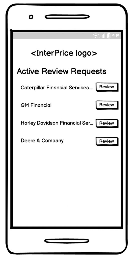
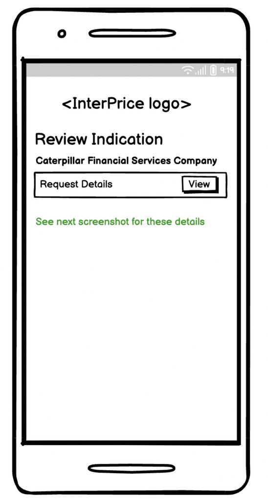
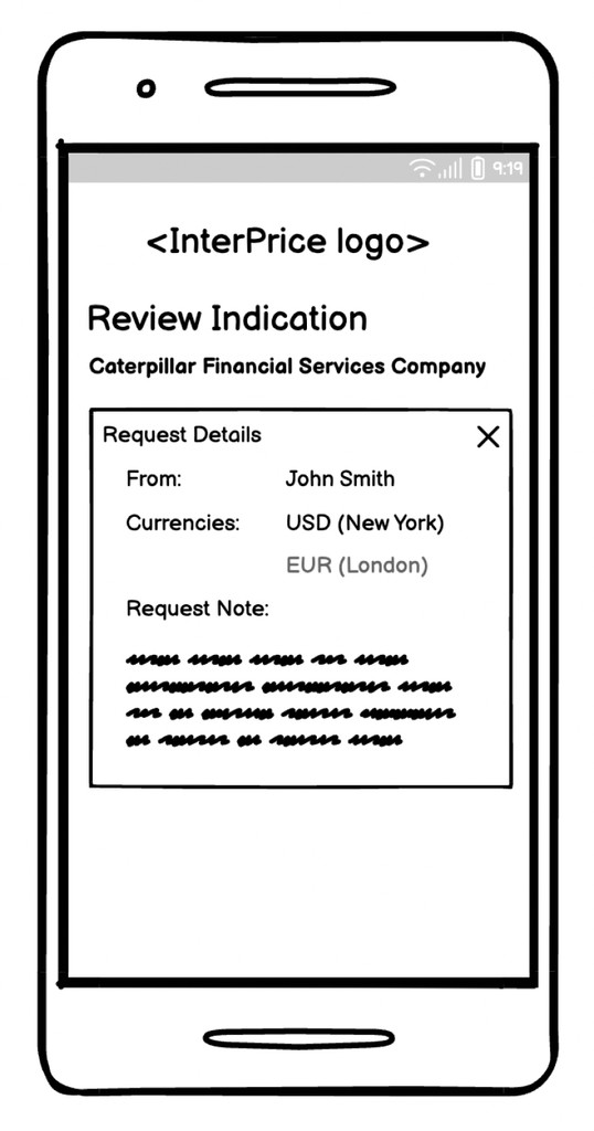
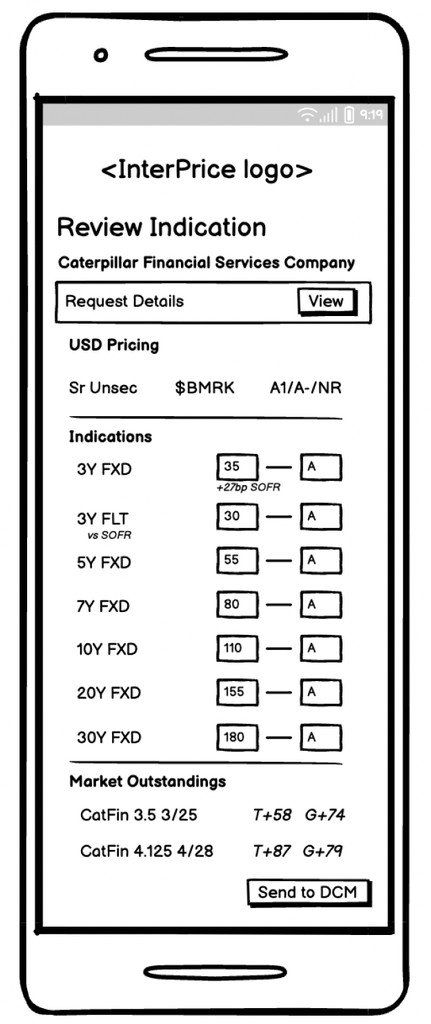
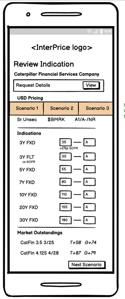
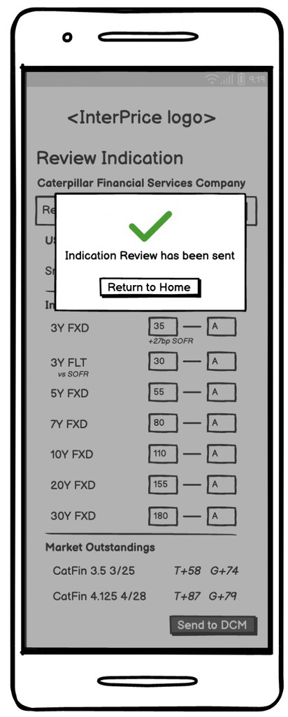
Low-fidelity wireframes
In the initial stages of the design process, low-fidelity wireframes were created to outline the basic structure and layout of the user flow. These wireframes served as a visual guide for organizing content and defining the interaction flow without detailing specific design elements. By focusing on simplicity and functionality, the low-fidelity wireframes allowed for rapid iteration and feedback, facilitating the exploration of different design concepts and ensuring alignment with project goals and user needs.
Analyzing the low-fidelity wireframes
This was a high priority design that needed to be released quick so I collaborated closely with the product manager to identify flaws within the low-fidelity mockups. Through this process, several pain points emerged:
Misleading landing page: When logging in, users might anticipate instant access to review indications by clicking the "Review" button. However, this design directs them to the initial information, potentially causing confusion and inefficiency in navigation.
Unclear detail presentation: Introducing "View details" before users view the indication lacks contextual guidance, leaving them stranded in specific details without clear direction or actionable items.
Missing functionalities: Lack of essential features, such as the sign-out option, back buttons, and validation messages.
To address these issues, I proposed an approach focused on eliminating unnecessary steps and providing users with direct access to relevant information. By simplifying the user journey and enhancing clarity, my goal was to improve overall user experience and satisfaction with this feature.
Design iterations
Throughout the design process, I remained mindful that I was crafting a mobile friendly feature, necessitating adjustments in button and input field sizing as well as spacing of elements compared to our desktop platform. Employing the iOS safe area grid, I ensured that all elements fit within the visible space, prioritizing user comfort and accessibility. Additionally, I conducted prototyping on a mobile device to guarantee ample finger space for seamless navigation, mitigating potential usability concerns.
One of the items I explored was the sizing of the the indication title and the placement of the "View Details" button.
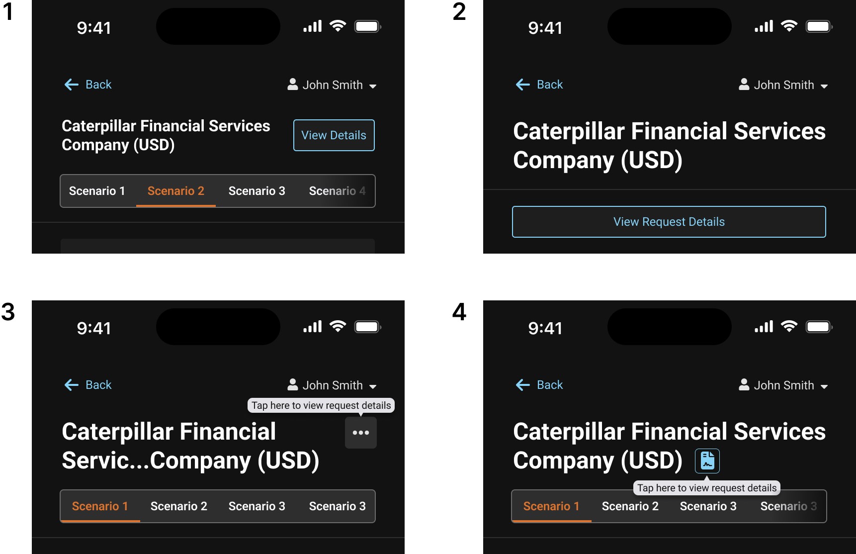
The indication title in the first design iteration was just big enough to show hierarchy without taking over the layout. The "View Details" button's positioning matched the title and added context without overcrowding the interface.
In the second iteration, the oversized indication title led to excessive scrolling on the page. The main objective of the page, which is to input indication data and send it to the DMC, was also compromised by dedicating an entire section to the title and button.
The third and fourth iterations had problems. The "View Details" button was absent from both designs, which may have resulted in users not finding it at all and missing the details feature entirely. Additionally, this could potentially frustrate and confuse less tech-savvy users, a significant portion of our user base. The title was still oversized and took away from the rest of the design.
After thoroughly reviewing all four options with the product manager, we concluded that option 1 was the best design. This iteration title successfully communicated hierarchy without taking over the design. In addition, the "View Details" button would be in frequent use, making it impractical to hide it away as in options 3 and 4. We also recognized that dedicating an entire section for the title and button wasn't necessary and would potentially introduce further complications.
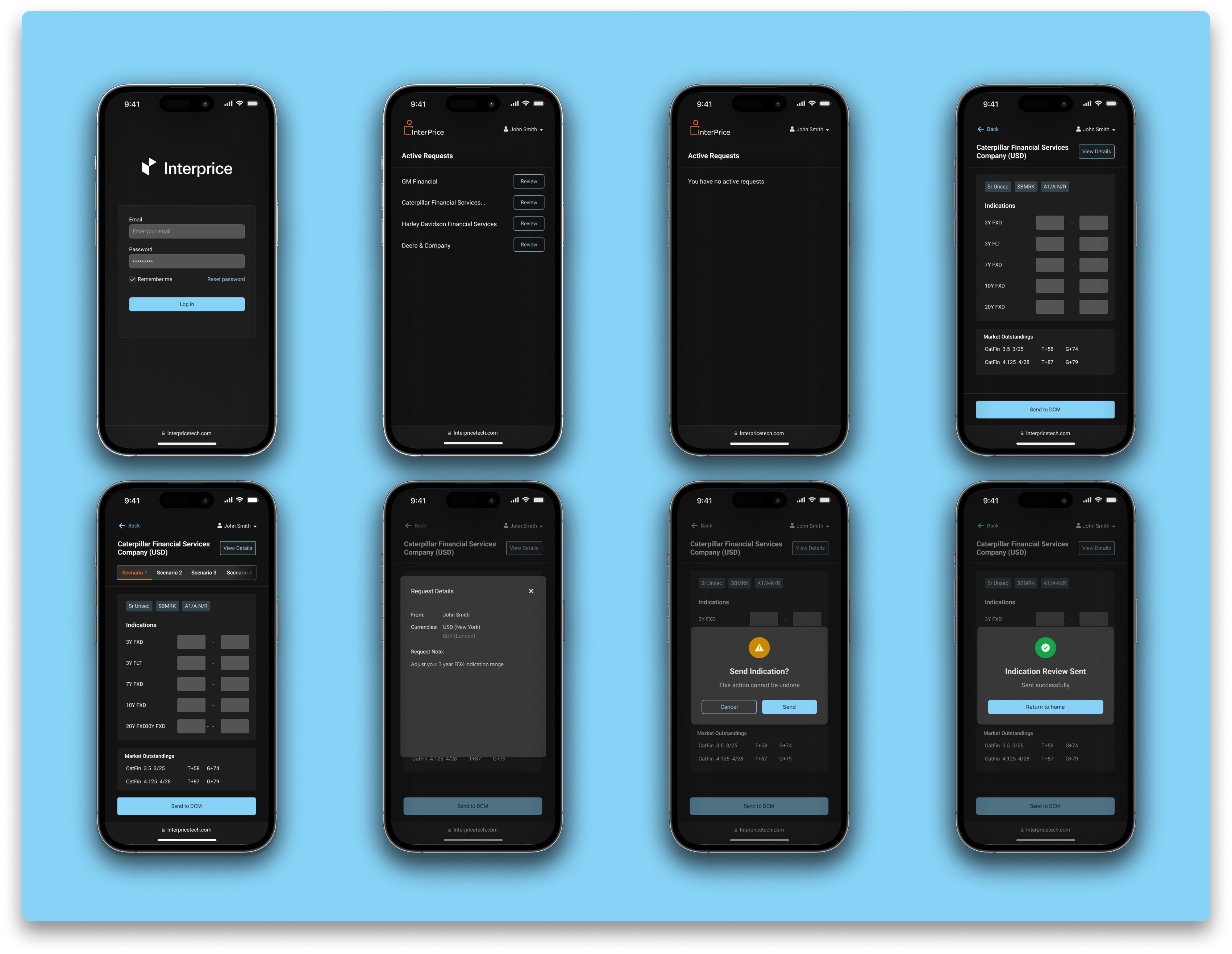
Final design
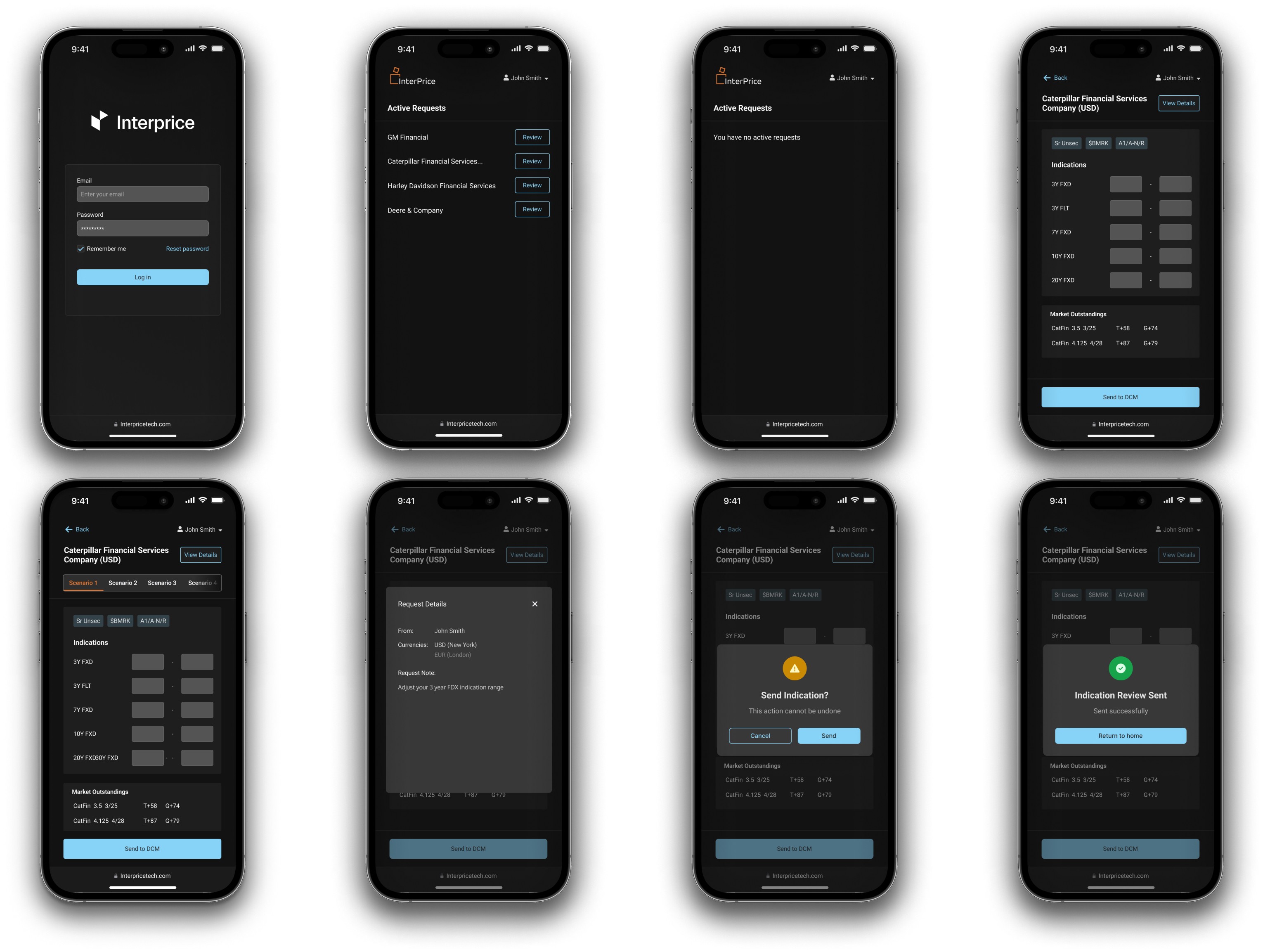
The final design effectively addressed our users' pain points with this feature, providing an accessible and user-friendly mobile friendly feature for communicating with their DCMs. The user flow is straightforward, prioritizing the removal of unnecessary steps and granting users direct access to essential information. Through simplifying the user journey and enhancing clarity, our objective is to enhance overall user experience and satisfaction with this feature.
Prototype
I developed a prototype to ensure the design was mobile-friendly, simplifying the review process for the product manager and offering developers a clear blueprint to expedite the development phase.
Design handoff
After the design approval, I got it ready for design hand-off to the developers. For design handoff, I put together the prototype and design elements into a new Figma page and created a gitlab ticket to handoff the design to the developers. Throughout the development process, I worked closely with the developers.
Impact
Enhanced efficiency: This design enhancement significantly improved users' efficiency and productivity by simplifying communication with their DCMs, enabling faster and more straightforward exchanges.
Positive feedback: Users provided positive feedback, emphasizing that the feature accelerated their workflow, eliminated the need to repeatedly review emails, and provided a clearer visualization of pricing details.
Addressed pain points: The redesign effectively resolved a key pain point stemming from the platform's previous lack of mobile compatibility. Users found traditional email communication with their DCM team to be more convenient than navigating the platform, particularly for transactions involving debt capital markets. By adapting this specific feature for mobile use, we addressed users' frustrations and streamlined their communication process.
Impact on business: Clients who collaborated with DCMs saw significant increases in process efficiency after implementing this capability. As a result, it developed as an appealing selling point, resulting in increased user engagement and adoption.