My journey towards a user-centric dashboard design
Summary
The Interprice dashboard serves as a tool for users to analyze pricing data across different banks, create peer groups, compare their activity with peers, and view pricing across various currencies. However, the existing dashboard suffered from disjointed information presentation, a lack of guidance, and complex data visualization, all contributing to user confusion and disengagement. Our goals were to increase user engagement, provide actionable insights without cognitive overload, and improve the overall usability of the dashboard for both power and casual users. We refined our designs ideas using a structured design sprint approach that lasted several days and included goal setting, user story creation, inspiration gathering, sketching, and user feedback sessions.
Project duration
Jan 2024 - Feb 2024
Responsibilities
Planning/collecting requirements, User feedback, Analyzing analytics, Goal setting, User flows, User research, Wireframing, Collaboration, Visual design
Tools and techniques
Figma, Figjam, Google analytics, User interviews, Sketching
My role
Throughout the project, I worked closely with design, product, and business teams, co-leading the entire process alongside another designer, from ideation to high-fidelity wireframes.
The problem
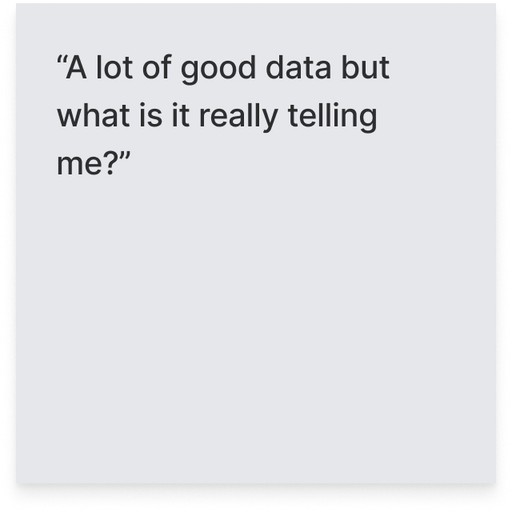
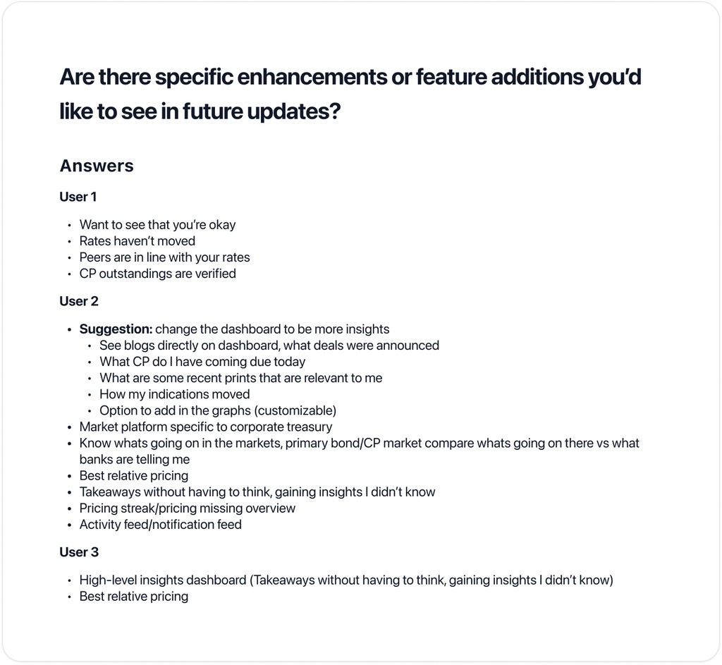
Users face challenges with mental overload, disorganized information, usability issues, and ineffective stat cards when interacting with the dashboard.
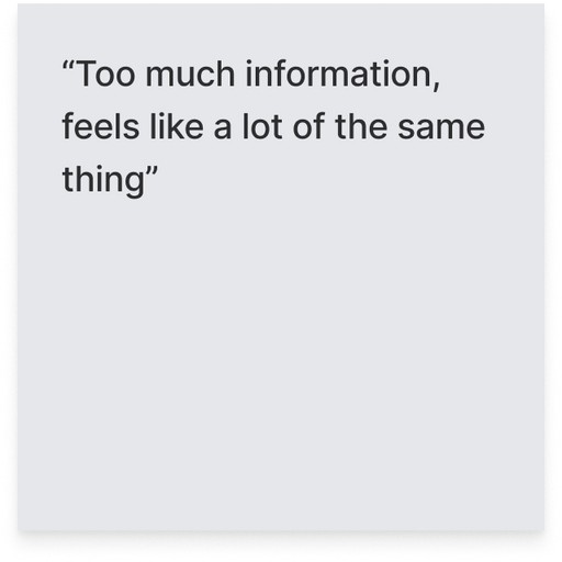
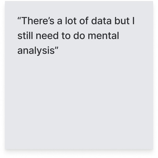
Mental overload: Despite the abundance of data, users are required to perform mental analysis, hindering efficient decision-making.
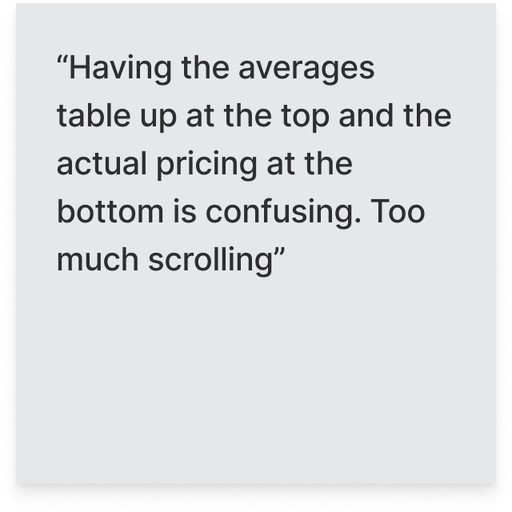
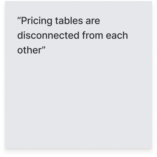
Disorganized information: Users pointed out the lack of a clear order in the current dashboard layout. As a result, they find themselves scrolling extensively, skipping sections in search of meaningful insights.
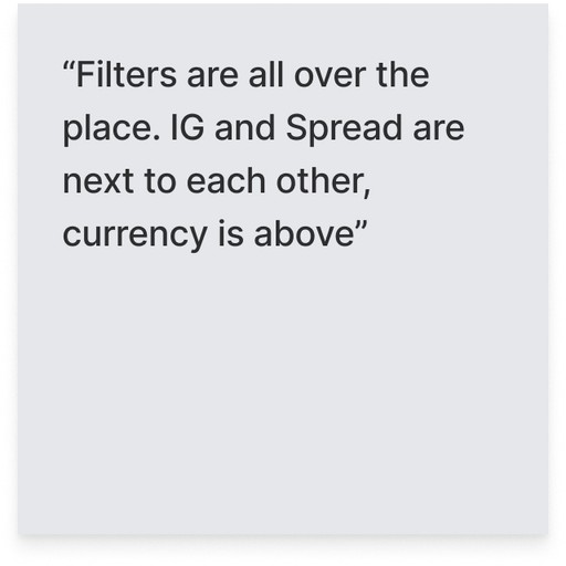
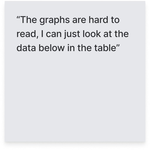
Usability issues: Excessive scrolling poses a challenge for users, resulting in frustration and inefficiency. Additionally, the placement of filtering options and buttons lacks coherence, making them difficult to locate and use effectively. Furthermore, poor graph legibility impedes users' ability to accurately interpret data, slowing down their process of extracting insights.
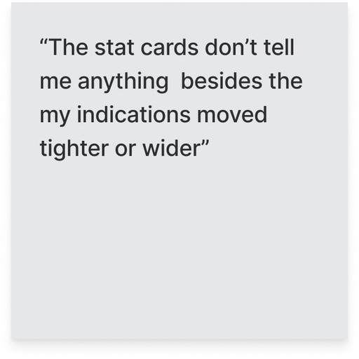
Ineffective stat cards: The stat cards positioned at the top of the dashboard fail to communicate relevant or actionable insights to users, resulting in confusion.
Understanding objectives and potential challenges
My design process began with focusing on understanding our objectives and anticipating potential challenges. To ensure alignment, the design and product teams collaborated closely to brainstorm our goals and potential challenges, ensuring everyone was on the same page.
Goals we want to reach with this re-design:
Enhance information delivery: Provide users with essential information for quick decision-making and intuitive platform navigation, embracing a "less is more" approach.
Create a distinctive dashboard: Develop a dashboard aligning with Interprice's mission by highlighting relevant data and offering user suggestions to enhance platform navigation and inform off-platform decision-making.
Facilitate daily guidance: Guide users to their daily tasks upon logging in, ensuring clear direction on their next steps within and beyond the platform.
Challenges we might face trying to reach our goals:
Navigating diverse workflows: Overcoming the challenge of accommodating varied user needs, potential missteps in guiding users, and addressing gaps in understanding their diverse workflows.
Simplification with substance: Balancing the challenge of streamlining the dashboard while ensuring it remains valuable
Navigating platform flow: Creating a seamless transition from the dashboard to other platform features for enhanced user navigation.
Collaborative brainstorming for user-centric solutions
We started a brainstorming session to figure out how to tackle the challenges we found. Rather than viewing these challenges as obstacles, we decided to view them as opportunities. We began user journey mapping after identifying five strategic opportunities aligned with our goals. We faced a challenge in designing user pathways, given the wide variety of users and products. After thorough discussions, we were able to define our approach clearly and create well-structured navigation paths for users.
Gathering inspiration
We took inspiration from a wide range of industry solutions and identified components that supported the goals of our project. This influenced our strategy for incorporating effective features into our design framework.
Sketching
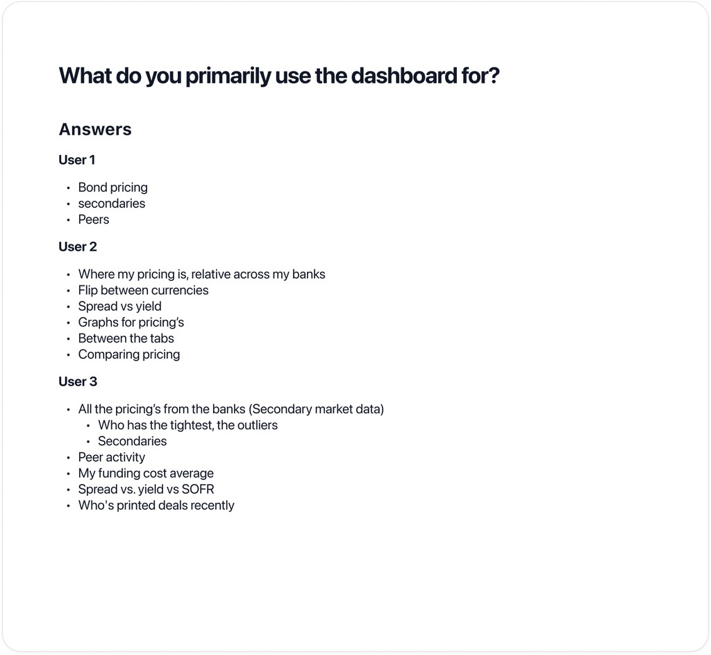
Following our inspiration exercise, we began drawing concepts for our new dashboard design. We carefully reviewed these ideas and narrowed them down to three potential options, one of which was more unconventional than the other two. Each team member helped develop these concepts by drawing out their vision for the dashboard interface.
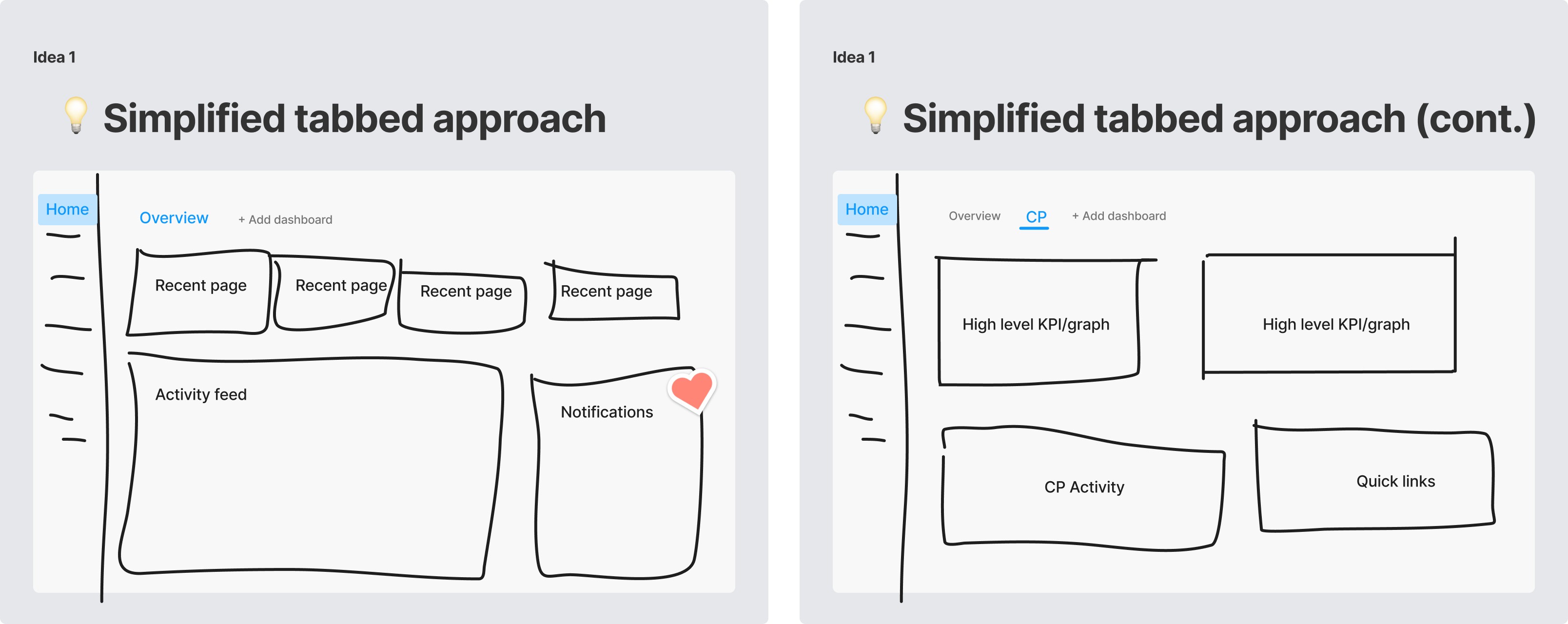
The first idea involved a simplified tab approach. Considering the challenges previously discussed, one concern was the potential disruption caused by replacing our current dashboard with a new one. We were worried about disrupting our clients who are familiar with our existing dashboard and depend on it for their daily work. To address this, our initial idea was to introduce a new "overview" tab. This tab would incorporate all the new dashboard ideas we had compiled without removing any current functionality. By doing so, we aimed to create space for further iterations and allow users to familiarize themselves with the new dashboard at their own pace.
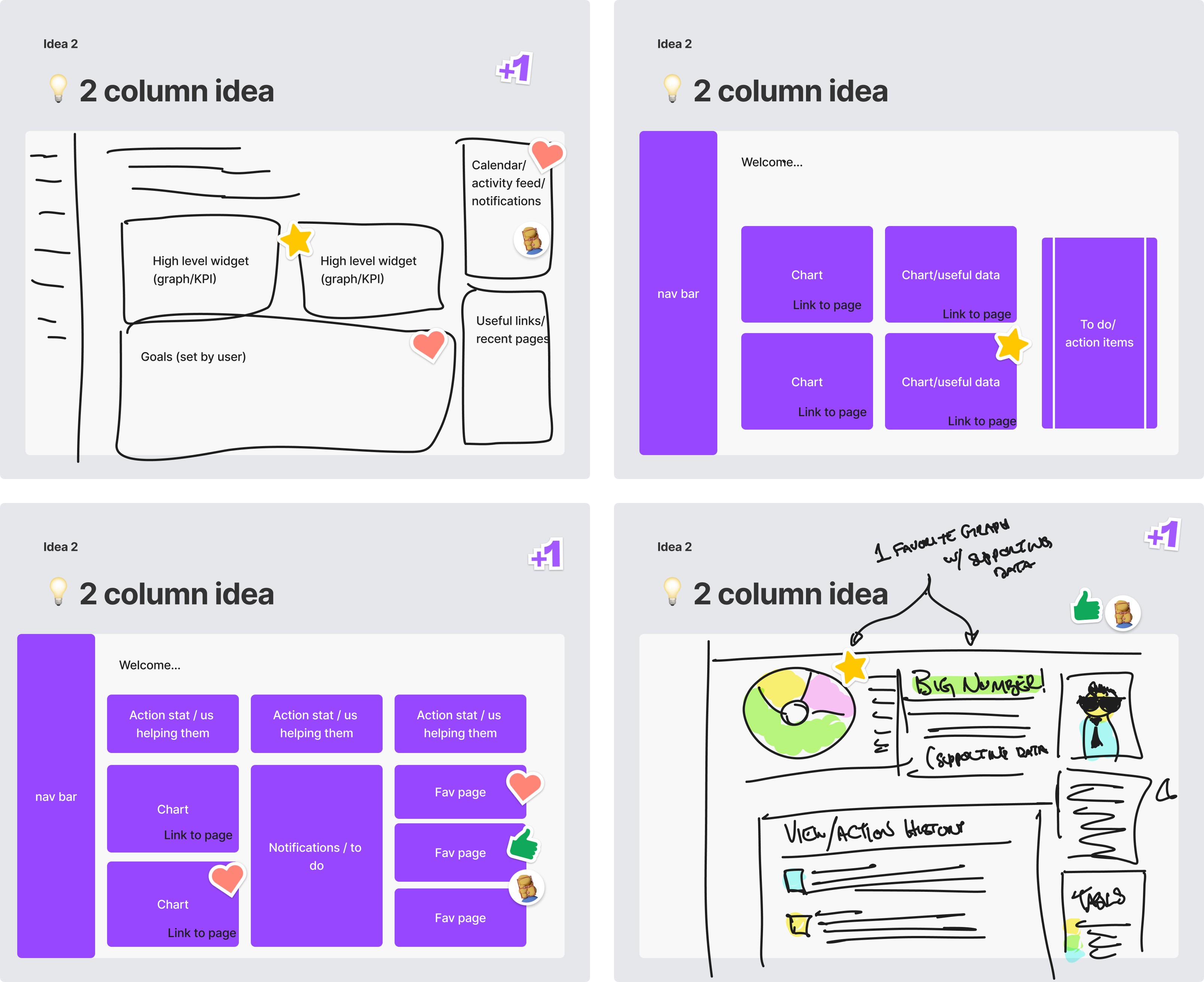
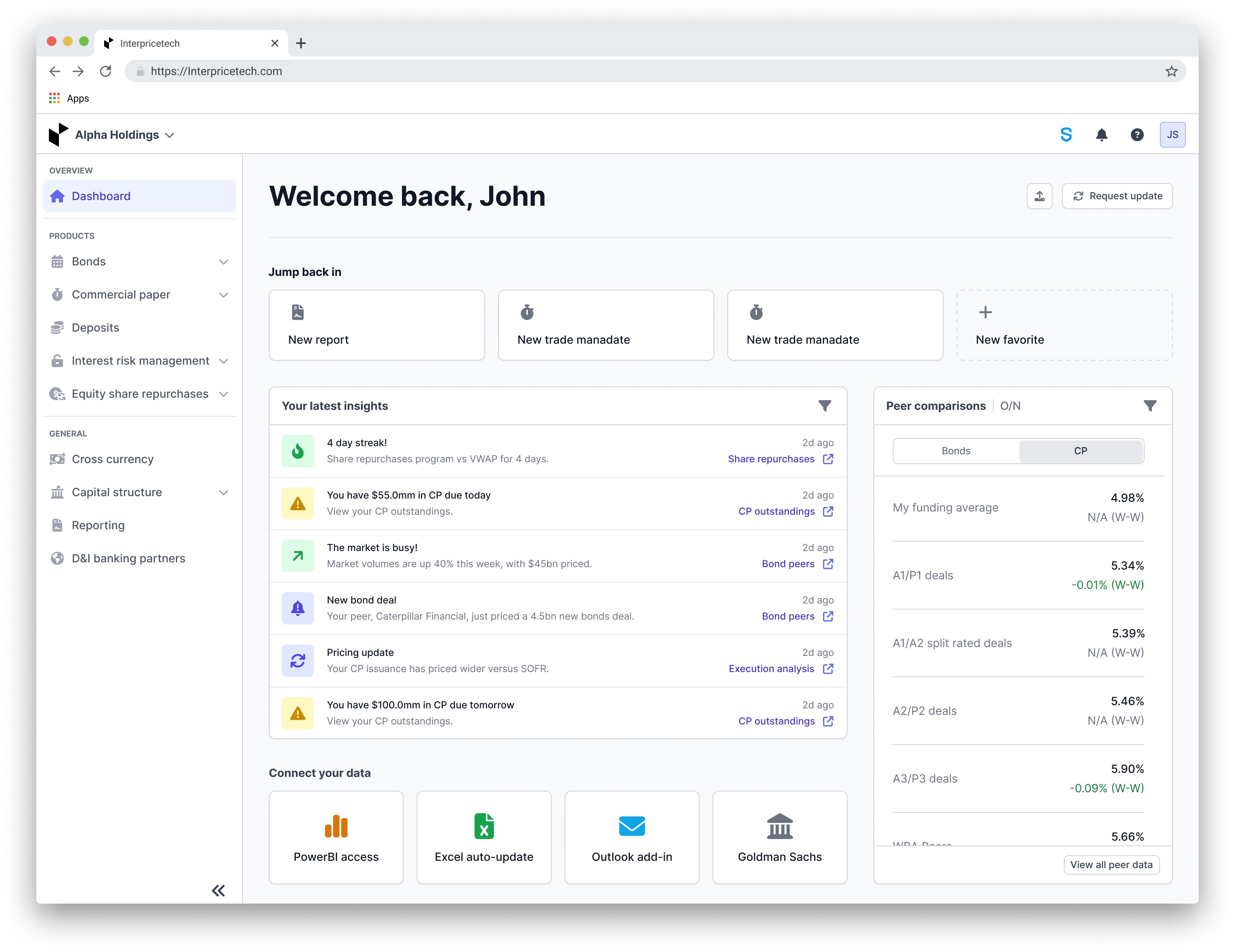
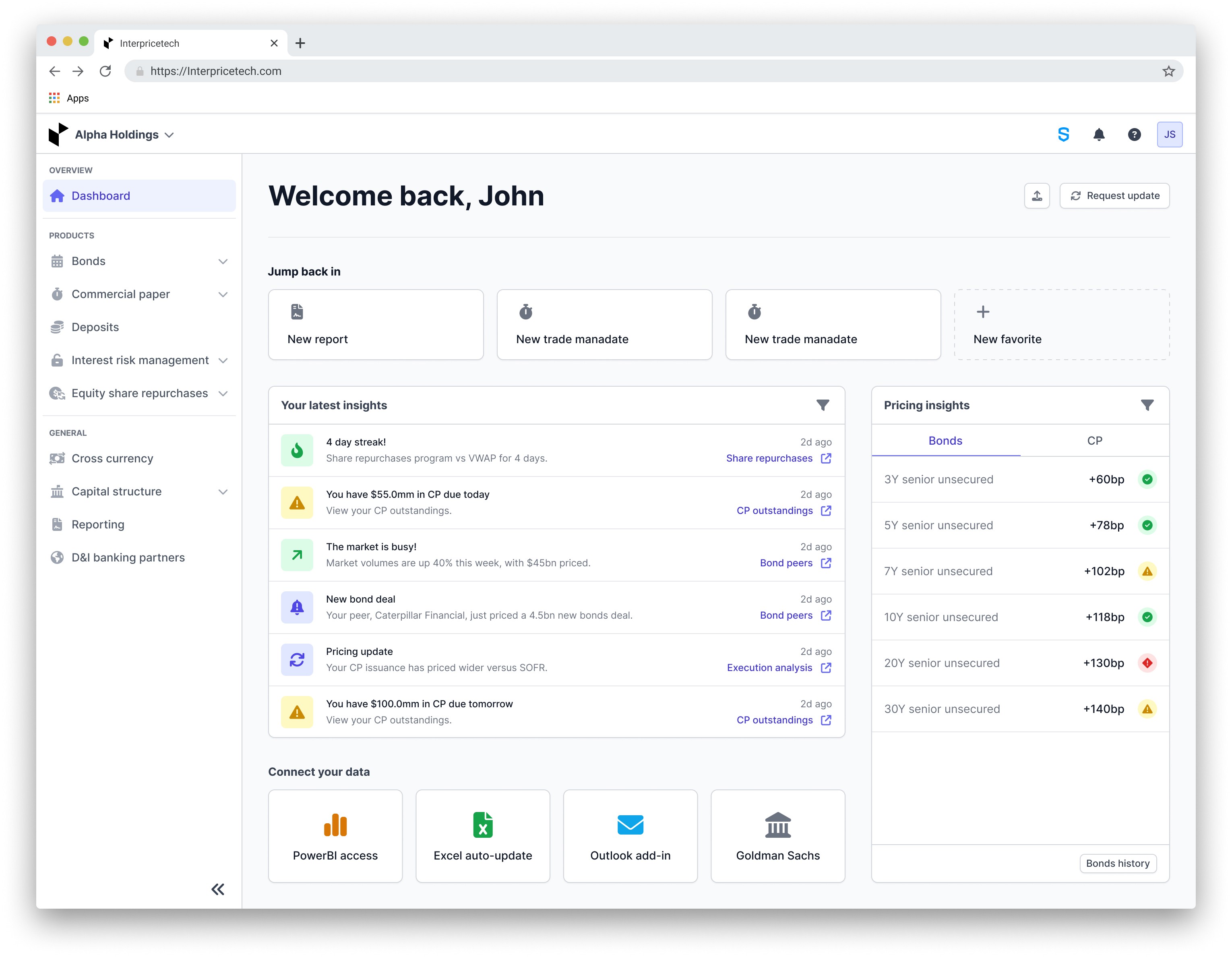
The second idea was centered around simplicity, aligning with the goals we established. This design concept aimed to maintain a strong focus on analytics, providing users with quick access to relevant data and seamless navigation to other parts of our platform. This idea had potential for customizable widgets with pre-set options that users could choose from to ensure every user was seeing information relative to themselves. Our objective was to enable users to effortlessly identify key information, plan their next actions, and seamlessly navigate to the corresponding platform sections for further exploration. To inform our design decisions, we planned to engage with clients to understand their needs and preferences, and also conduct an analysis of platform analytics to ensure the inclusion of the most frequently used items.
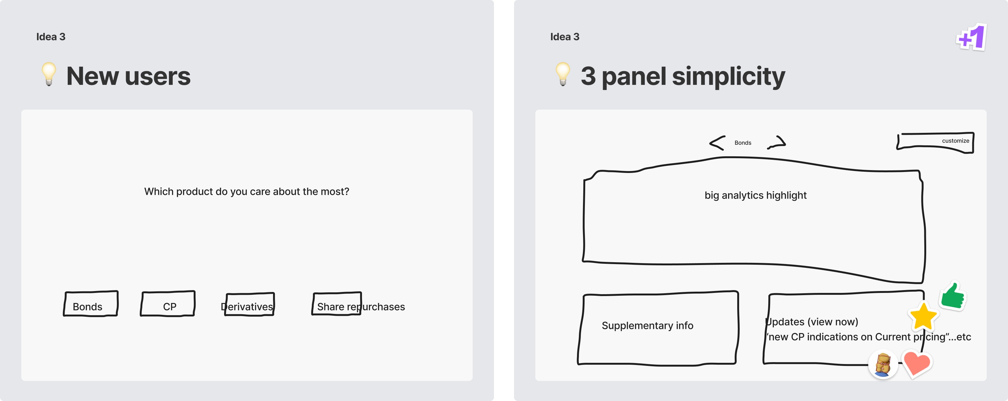
The third idea was a much more out-of-the-box idea. It was inspired by platforms like Netflix, where we would ask new users a few questions to personalize their experience and then offer tailored dashboards based on their responses. We knew this concept was unconventional for our platform, but we were intrigued by certain aspects, particularly the idea of a quick questionnaire upon logging in. We believed there was value in understanding our users' preferences, especially considering the diverse range of users we have.
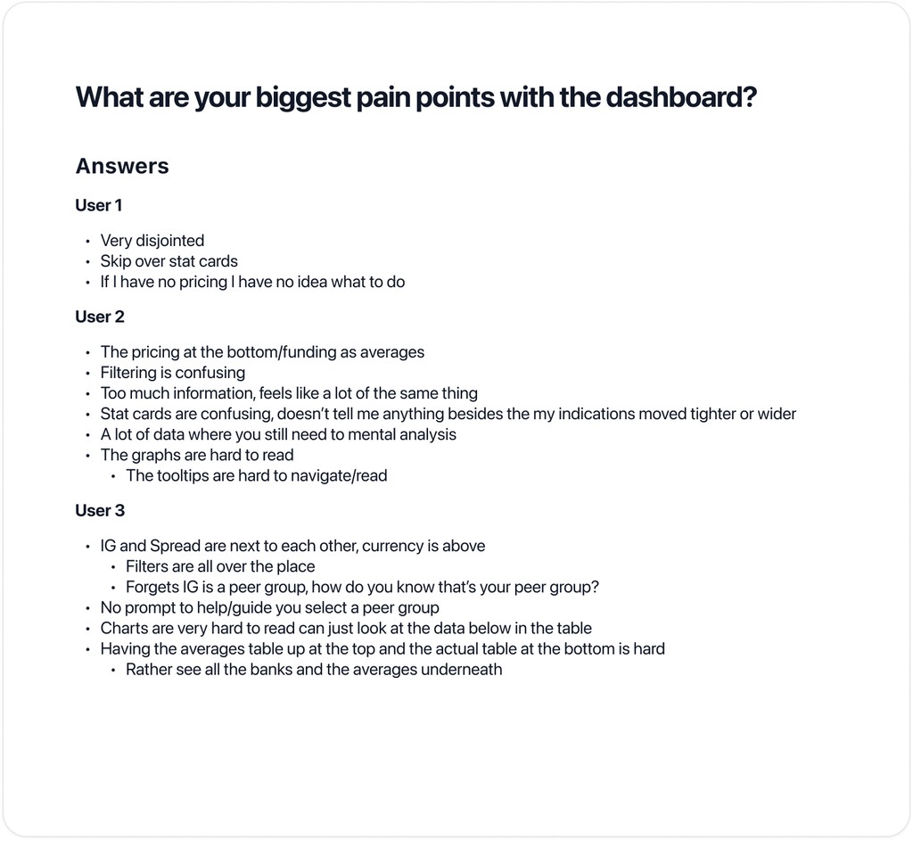
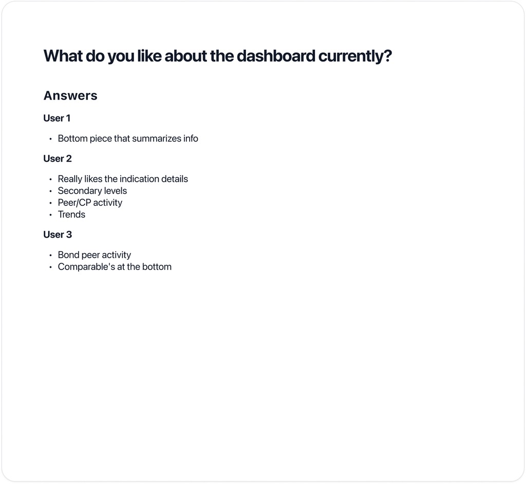
User interviews
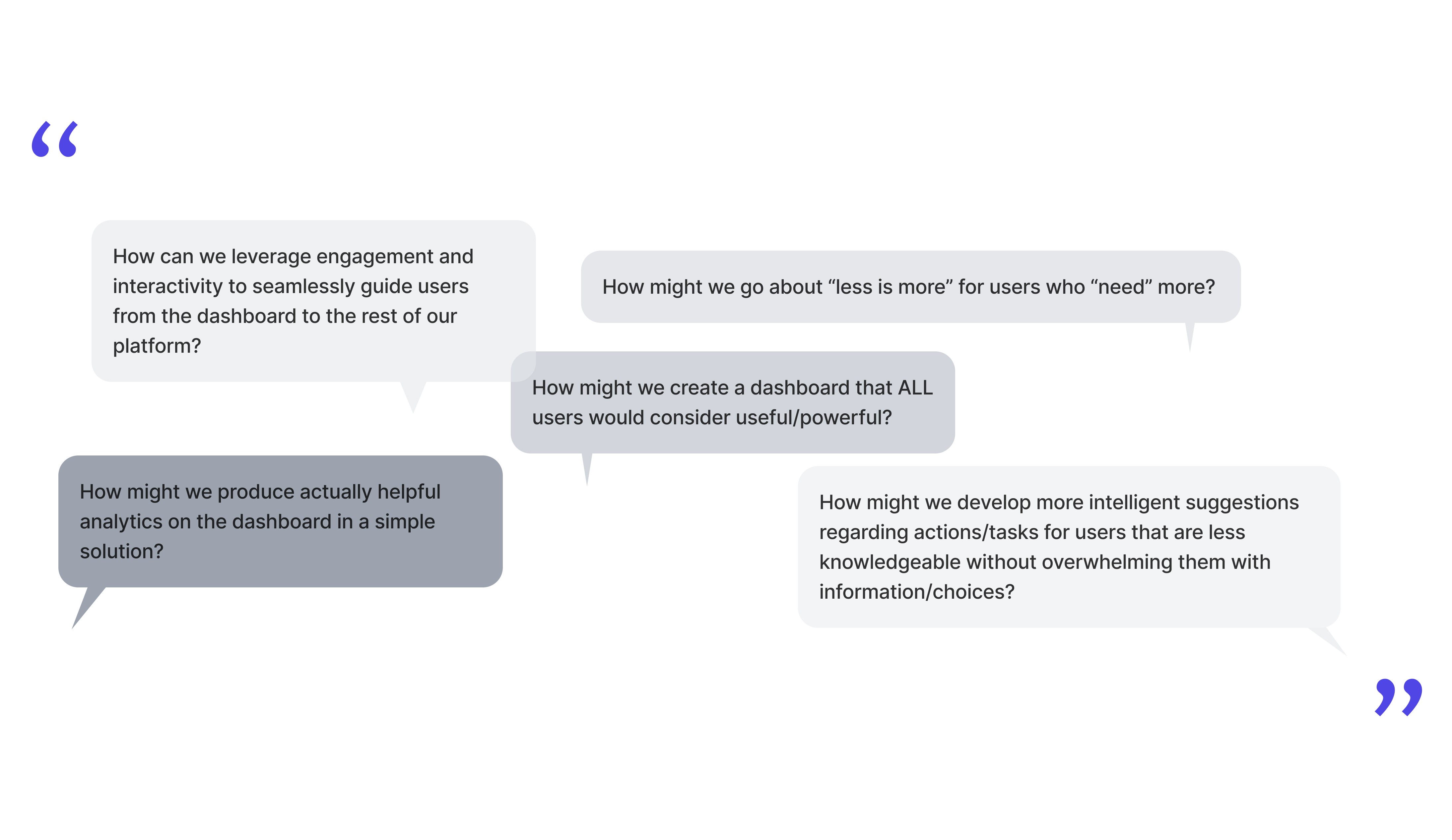
We interviewed three participants to gain insight into their usage of our dashboard and the challenges they face. Although our initial goal was a larger sample size for broader perspectives, the insights gained from these interviews were crucial in shaping our wireframing strategy. This feedback guided our design process, allowing us to refine our concepts into two polished iterations.
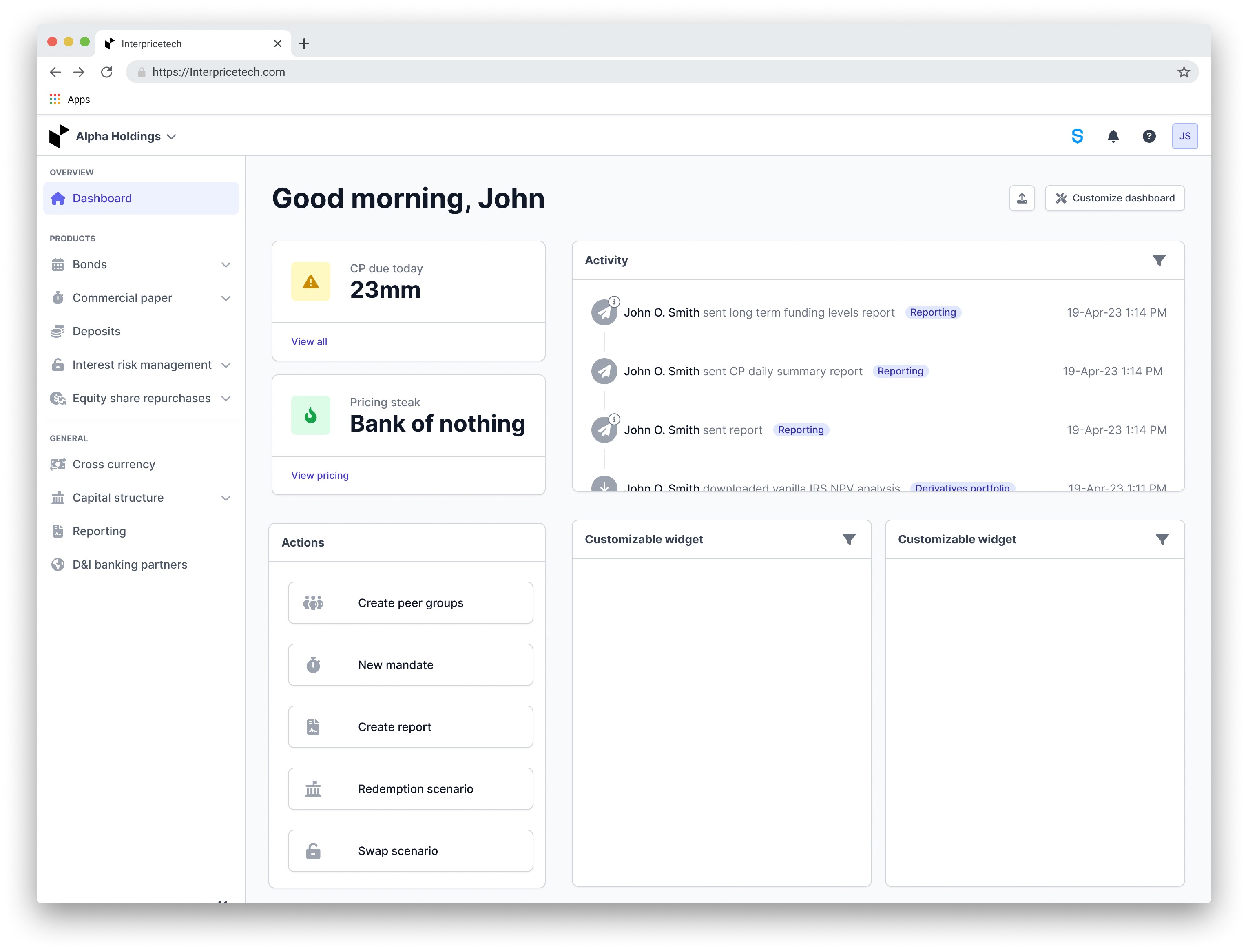
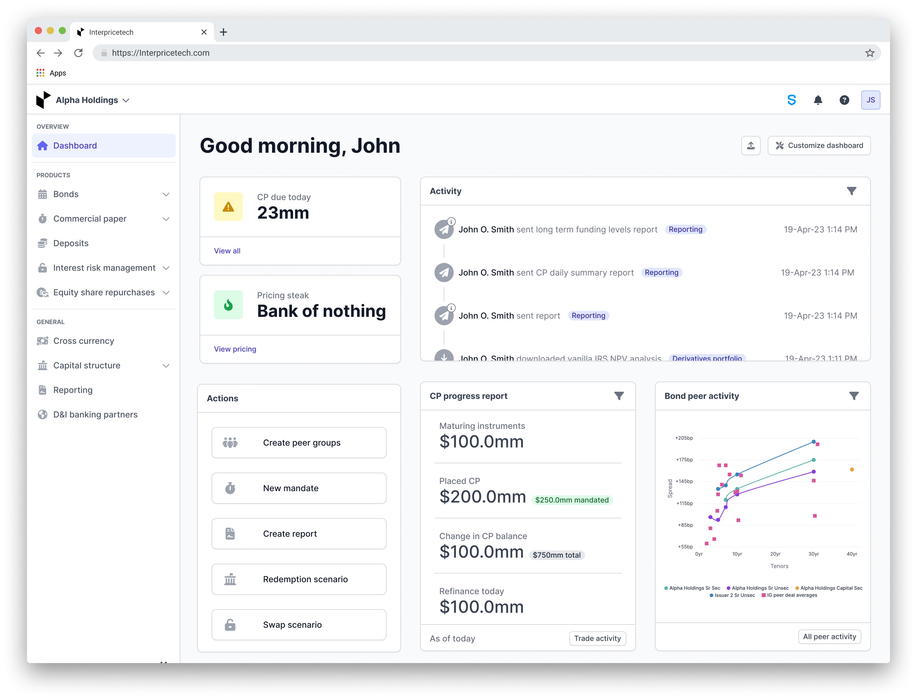
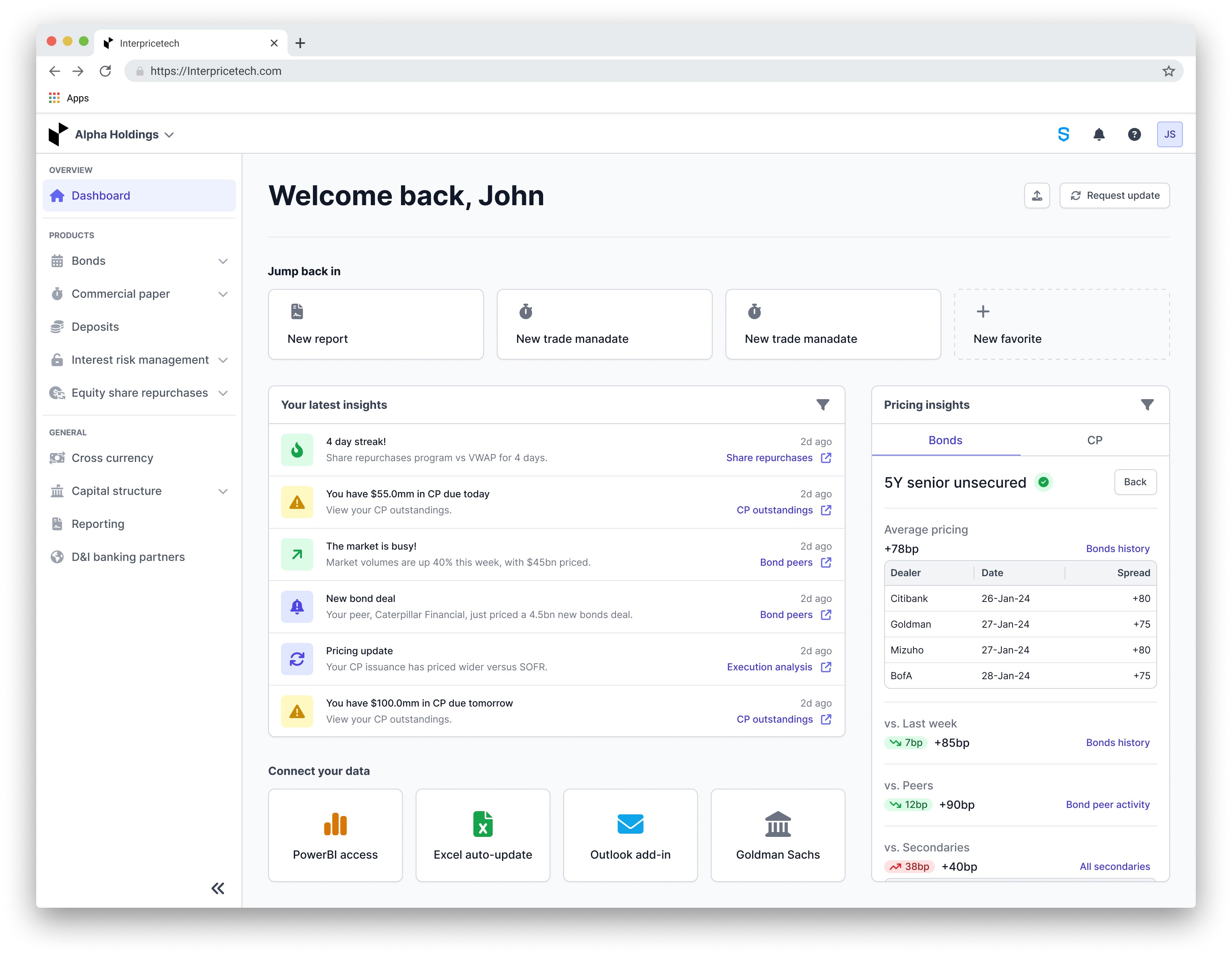
Before and after
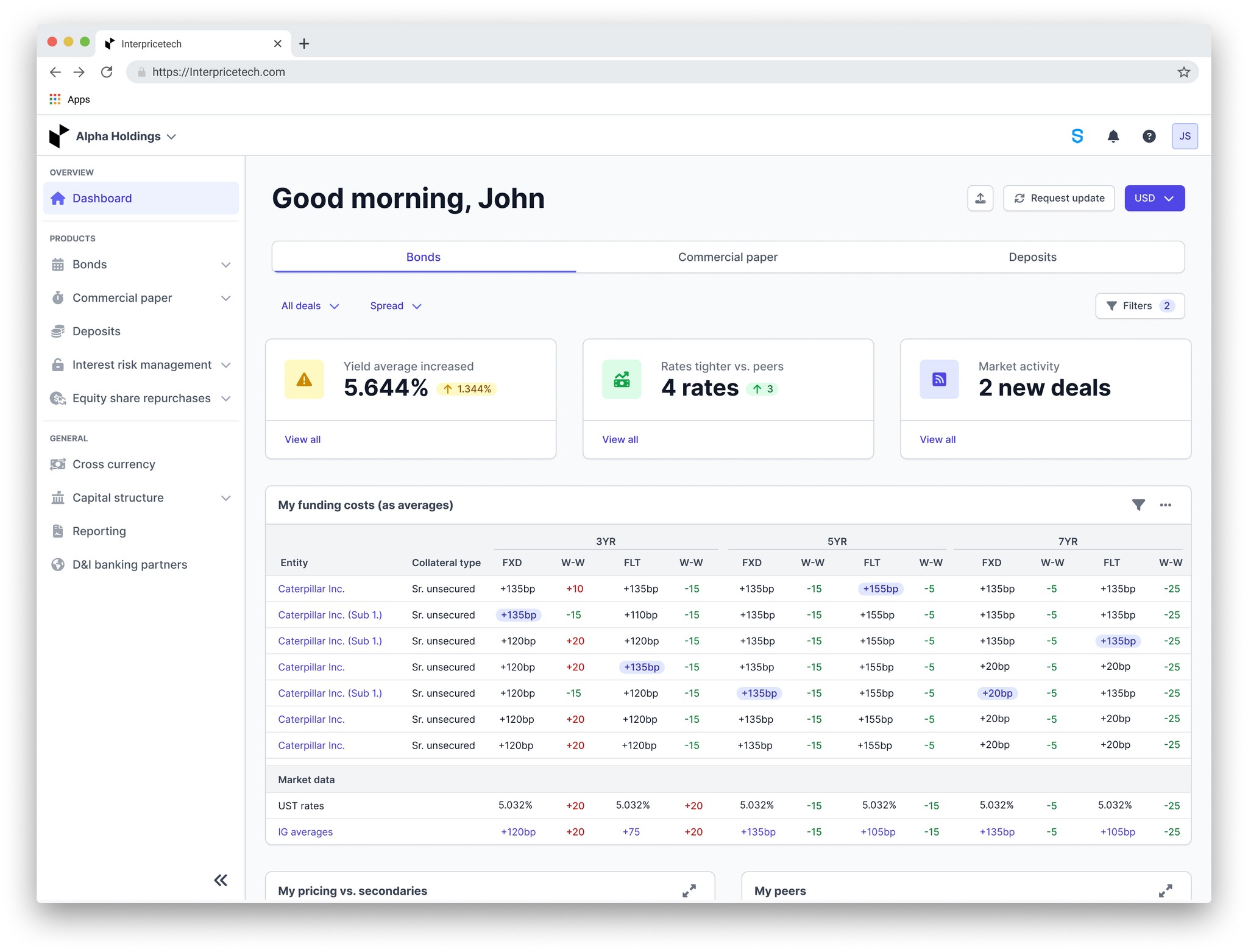
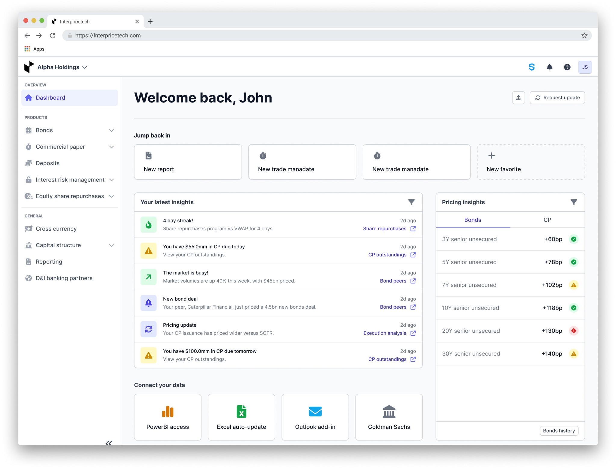
Users encountered several issues with the current dashboard. Firstly, they experienced mental overload due to the sheer volume of data, complicating decision-making processes. Secondly, the layout lacked organization, resulting in extensive scrolling to locate relevant information. Additionally, usability problems arose from excessive scrolling, poorly placed filtering options and buttons, and graph legibility issues, hindering efficient data interpretation. Lastly, the stat cards positioned at the top of the dashboard failed to effectively communicate actionable insights, leading to user confusion.
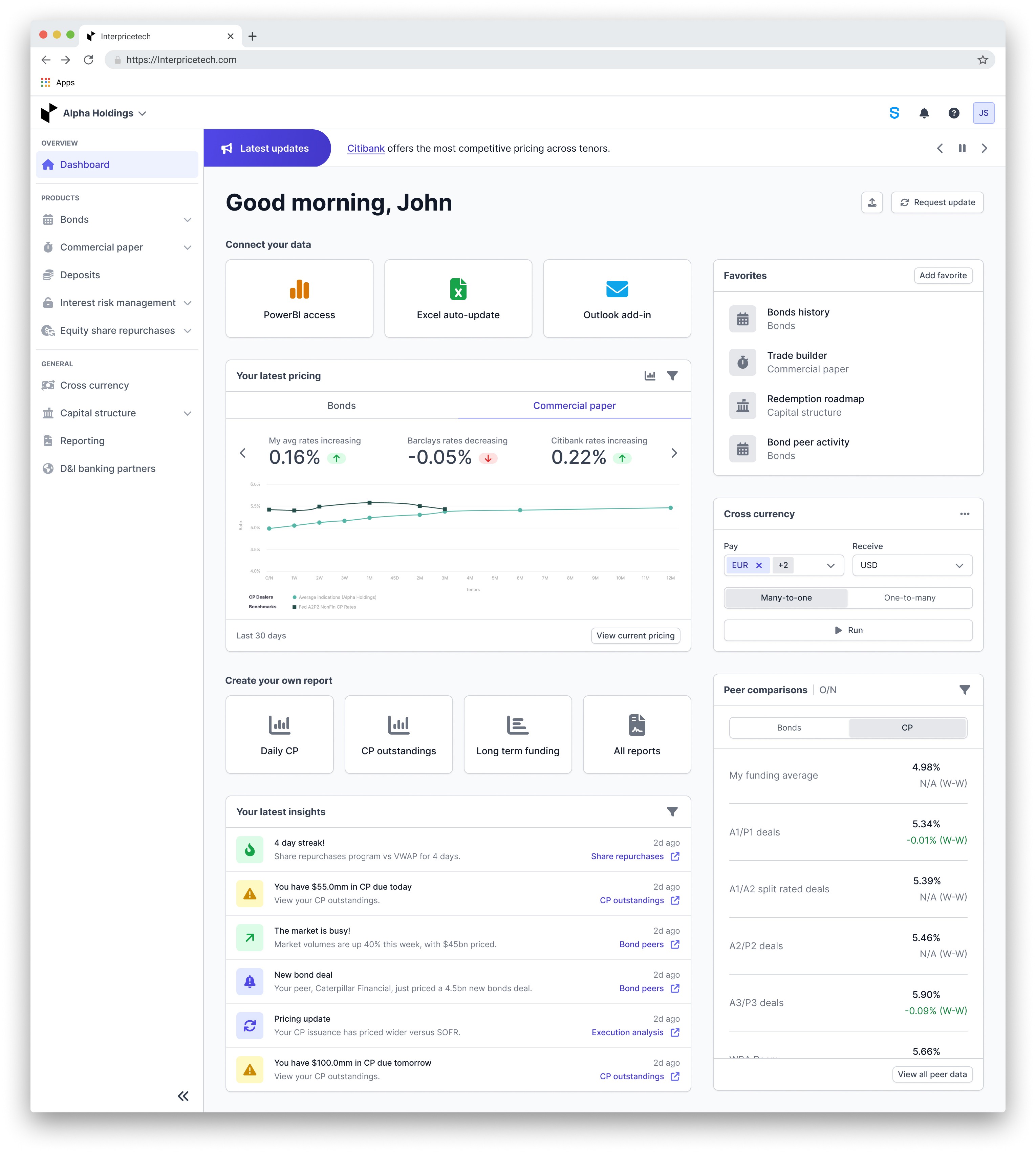
Goals achieved with the new design:
Enhanced information delivery: We streamlined the presentation of data, providing users with essential information in a clear and efficient manner to facilitate quicker decision-making and smoother navigation, all while maintaining a clean and minimalist design.
Distinctive dashboard creation: Our redesign resulted in a visually appealing dashboard that aligned seamlessly with Interprice's brand identity. We effectively highlighted key data points and integrated user-friendly features to improve navigation both within the platform and in external decision-making processes.
Daily guidance facilitation: Through strategic design choices, we implemented features to guide users through their daily tasks upon logging in, ensuring clarity and direction in their actions within and beyond the platform.
Challenges overcome in achieving goals:
Navigating diverse workflows: We successfully addressed the challenge of accommodating diverse user needs by carefully considering and integrating various workflow scenarios, ensuring a cohesive and user-centric experience for all users.
Simplification with substance: Balancing simplicity with depth of information proved to be a challenge, but through thoughtful design decisions, we achieved a harmonious blend, providing users with streamlined access to essential data without sacrificing substance.
Platform flow navigation: Integrating the dashboard seamlessly with other platform features required meticulous planning and execution. However, by implementing intuitive navigation pathways, we ensured a smooth transition for users between different areas of the platform, enhancing overall usability and efficiency.