Equity share repurchases tracking and reporting
Summary
The 'Repurchase activity' feature streamlines tracking, management, and reporting of repurchase programs for issuers. By allowing users to monitor their stock repurchases, the platform aims to help companies boost their stock prices. Traditionally, manual tracking and reporting have been pain points for issuers. The feature addresses these challenges by providing real-time insights and comprehensive reporting capabilities. The interface prioritizes simplicity and accessibility with two distinct views: total activity and individual program sections. Users have quick access to recent activity summaries and detailed program analytics for any chosen timeframe.
Year
Dec 2023 - Jan 2024
Responsiblities
Collect requirements, User flows, Wireframing, Development handoff, Quality assurance, Client demos
Tools
Figma, Balsamiq
My role
As the project's lead designer, I worked closely with the product manager to ensure that the design met all requirements effectively. I wireframed several design iterations, worked with developers during the handoff process, and performed quality assurance testing to ensure optimal functionality. Additionally, I actively participated in client demos of the new product, to identify and address any potential pain points or usability issues.
Goal
The pain point for issuers in regards to share repurchases is the tracking and reporting that is often done manually. Our goal for this feature is to allow both easy tracking with up-to-date information and statistics as well as reporting capabilities that cover all the needs of our clients.
Low-fidelity wireframes
During the early stages of the design process, we developed low-fidelity wireframes. For the low-fidelity wireframes I worked closely with the product manager as he had the expertise and logic for the feature.
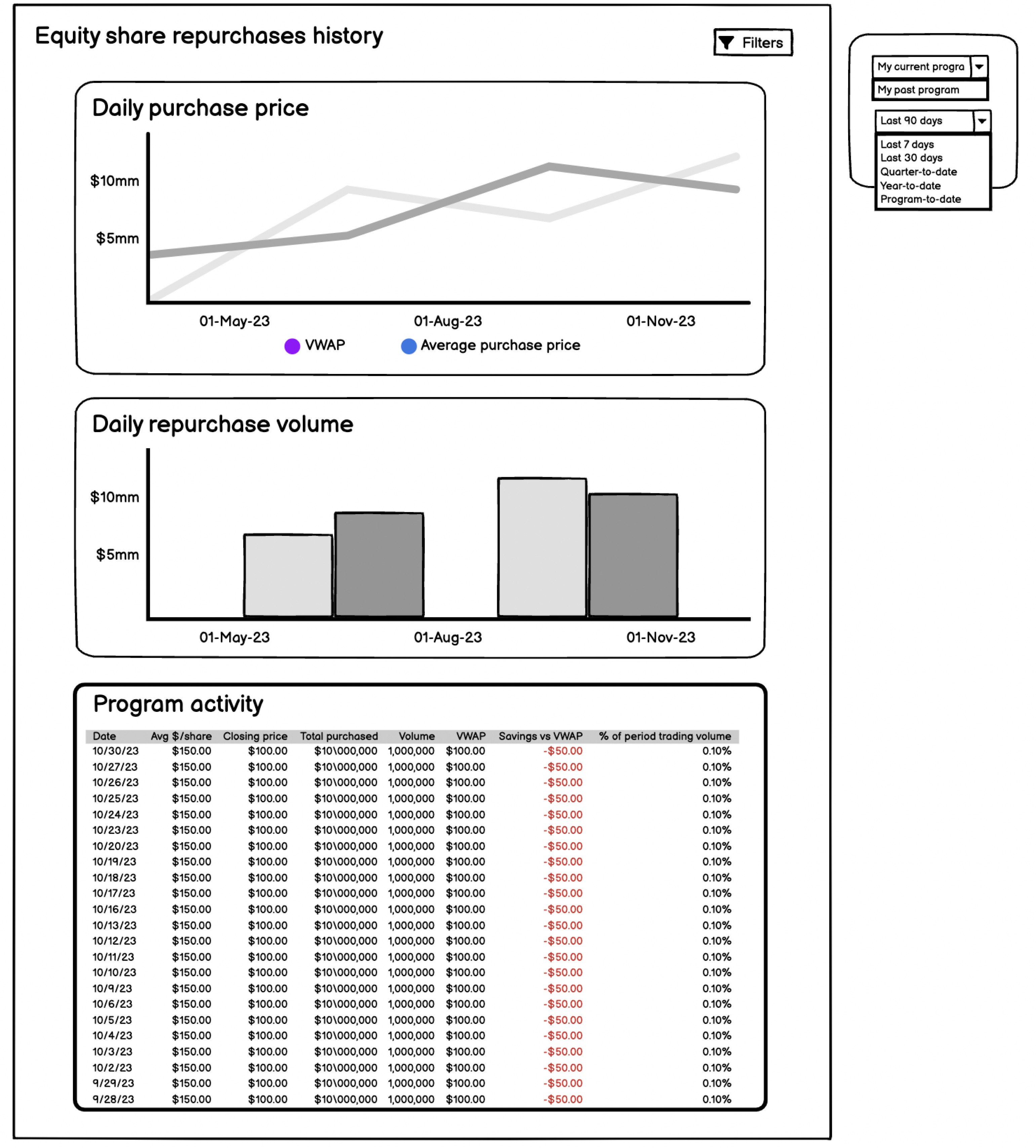
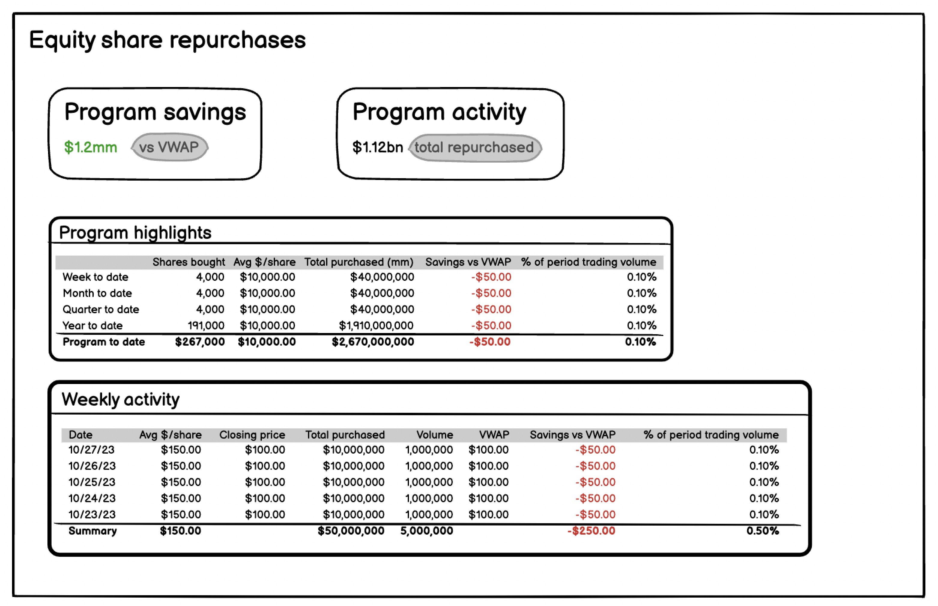
Analyzing the low-fidelity wireframes
The first thing I noticed was that the historical page had filters that the equity share repurchases page did not, even though the information was very similar. This led to the realization that both pages should have filters to view different programs. Originally the idea for this feature was to have to separate pages but after reviewing the design, I noticed that the two pages had very similar data and proposed combining the two into one page with the ability to still see all the information in the wireframes. To verify my evaluation, I contacted the product manager, explaining my findings and seeking answers to several questions.
Q&A with product manager
Equity share repurchases page:
Q: What will users be taking from this page?
A: Users will want to see their latest trading details which is the week to date row in the program highlights.
Equity share repurchases historical page:
Q: Do both of these pages need these filters, currently they're only on the historical page?
A: Yes both pages need a program type filter. Depending on the users, some could have more options than others.
Q: How helpful/useful are these graphs? Will users use them often? Can they be moved into a modal?
A: Yes a modal might be better. They will not be used often here, these graphs will be used for the PDF reports so we need to have them somewhere on the platform too.
Q: Program activity here and weekly activity above look like the same data one with just more dates, is there any other difference?
A: No. They are the same one is just focused on the week while the other is the whole program.
Q: So if users filter last 7 days on this page it’ll show the same exact information as the page above?
A: Yes.
After understanding this feature a little better I started the first design iteration.
Design iterations and feature release process
Iteration 1
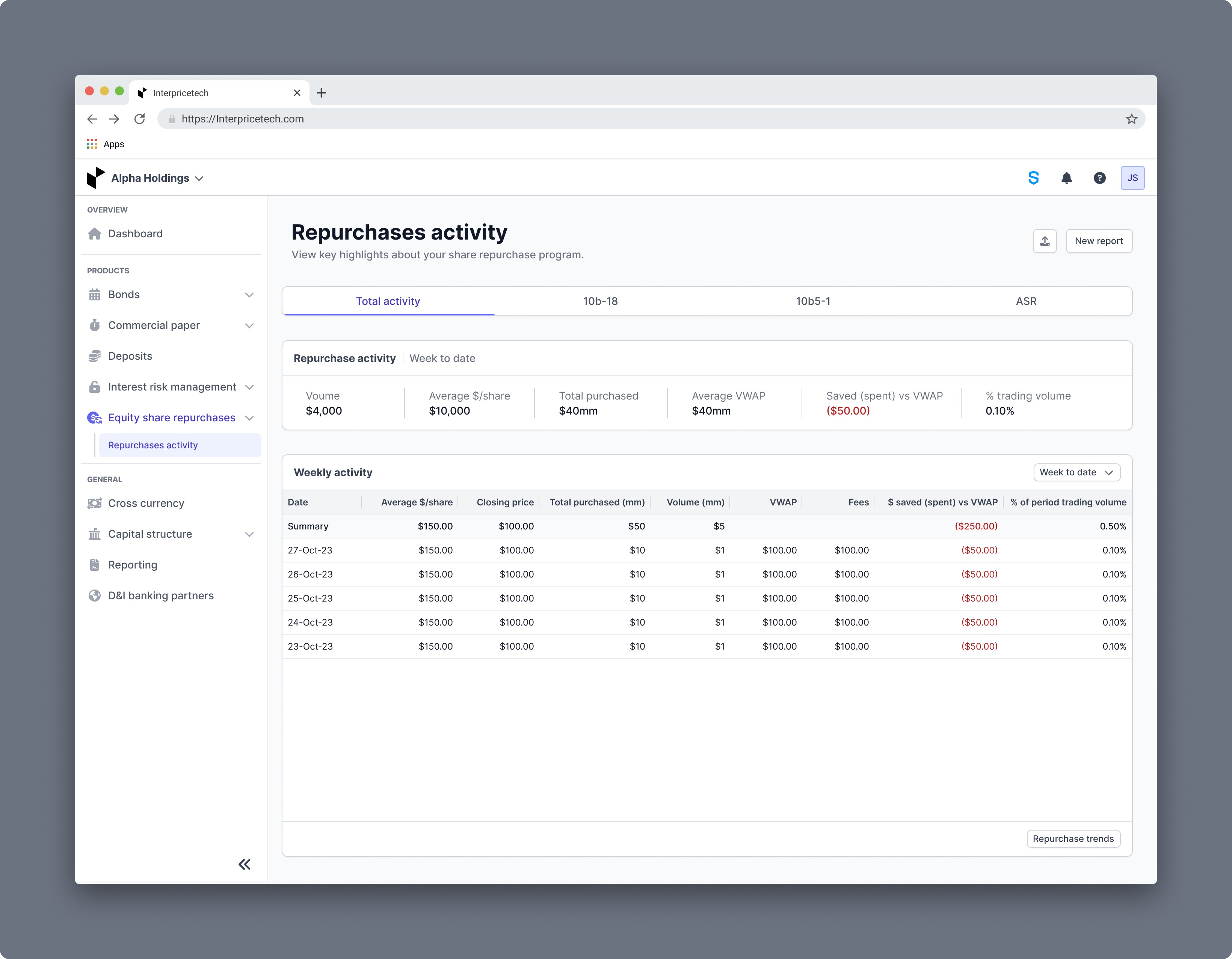
For the first iteration, I combined the two low-fidelity wireframes. Rather than treating different programs as filters, I chose to present them as tabs, which serve more as a way to switch views than to filter content. This approach keeps users informed about which program they are currently viewing, with a maximum of four tabs visible at any given time.
The filter at the top of the page allows users to access information ranging from week to program to date. Keeping in mind that the last trade part is the most significant information for our users on this page, I designated a separate place at the top of the page to make it easy to digest and find.
In addition, I added a menu accessible via ellipses that allows users to upload data and generate reports directly from the page. I relocated the graphs from the historical page to a modal, which is accessible via the "Repurchase trends" button in the footer of the weekly activity card, this improves access to key insights while keeping the interface clean.
Iteration 1 feedback
After discussing this design iteration with the product team, the following observations and insights were made:
While the programs have pre-set names, users do have the ability to customize the names as well.
They loved the repurchase activity card but after some discussion we decided that that card should always display the latest trading data rather than changing based on the filter selection.
Regarding the ellipses button, there was a worry that users might find it more difficult to find the actions to report and upload data.
If users do not have any data uploaded this will just be a blank page, we need some way to guide users to upload data.
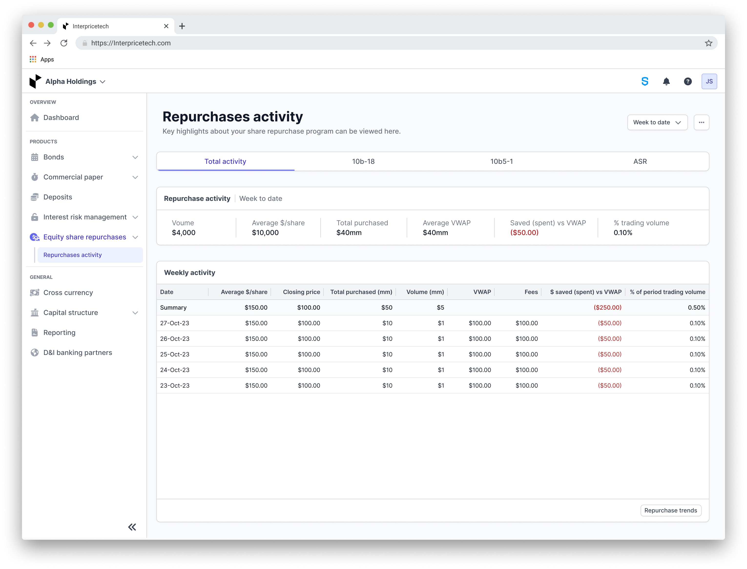
Final iteration
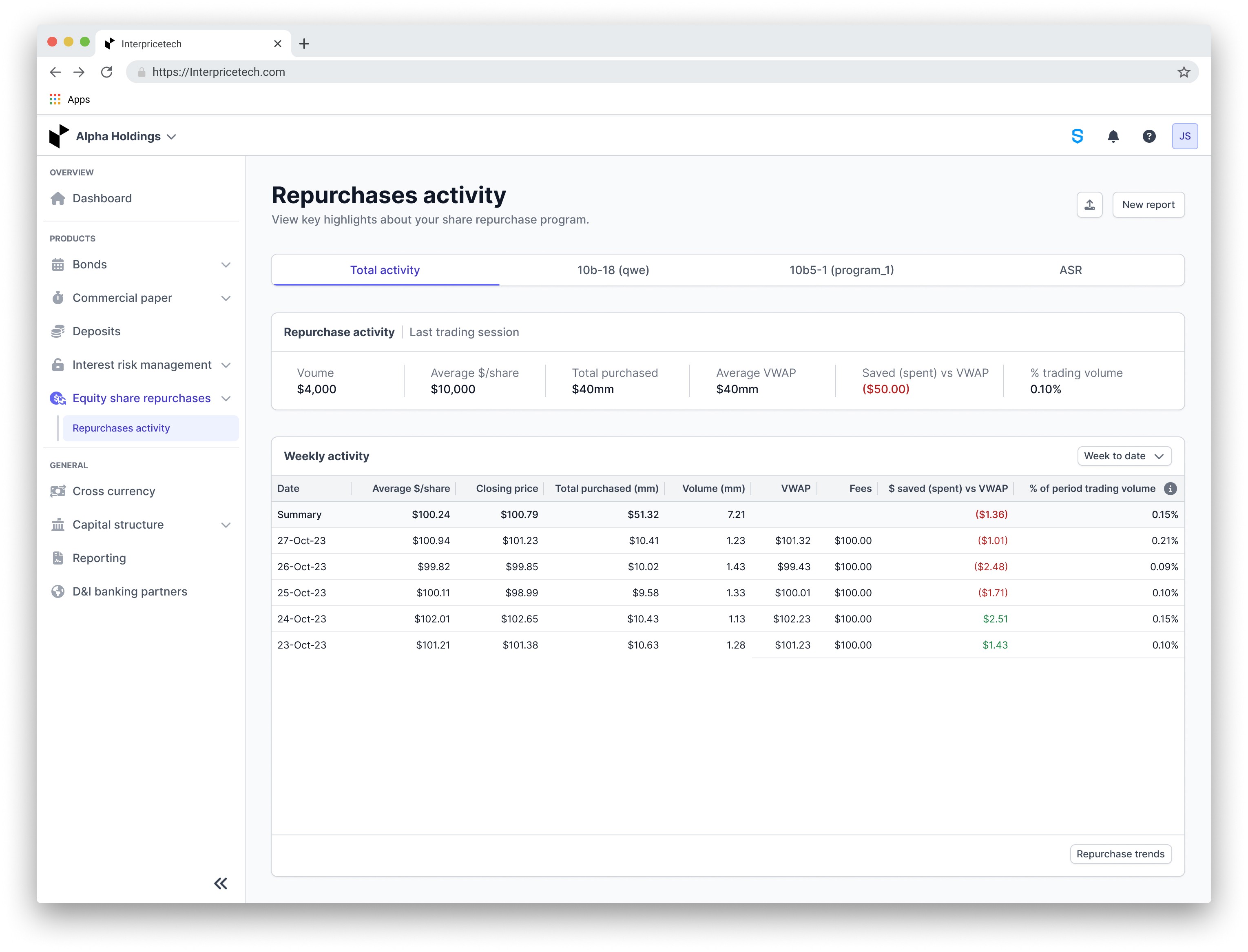
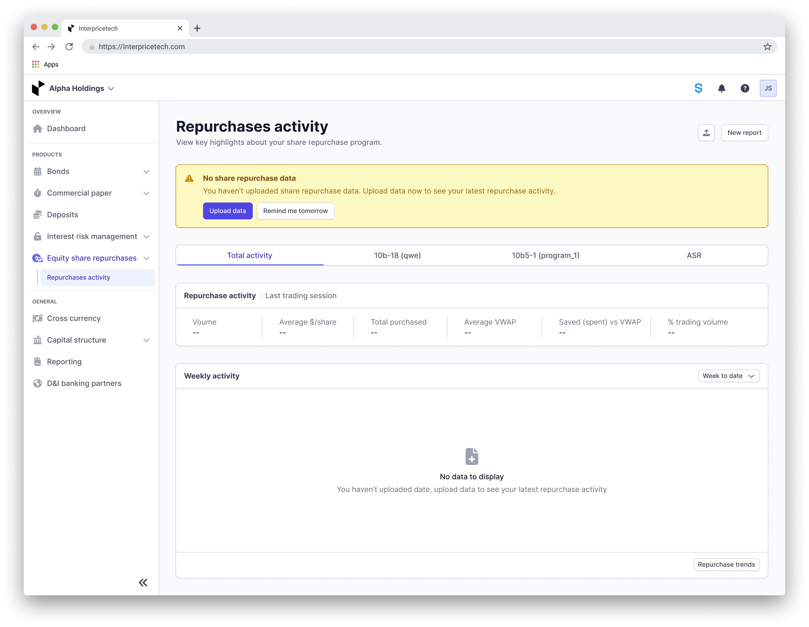
The final improvement: Users' customized program names will now appear in parenthesis next to the pre-set program names when they edit them. The repurchase activity section is updated to consistently display the latest trading session's information. Additionally, I relocated the week-to-date filter to the lower card, as it's now the only section affected by the filter. The options for creating reports and uploading data have been taken out from the ellipses menu to improve visibility. For users without any data uploaded, a prompt will now appear at the page's top, encouraging them to upload data to view their most recent repurchase activities.
Final iteration feedback:
The product team provided positive feedback on the latest updates, pointing out a number of significant improvements:
The addition of personalized program names alongside the original names improves navigation and personalization.
Updating the repurchase activity to always display the latest session data ensures users have quick access to critical information.
Relocating the week-to-date filter to a specific area makes the page more intuitive and user-friendly.
Moving the report and upload functions from the ellipses menu will improve their accessibility.
The new alert for users without data effectively directs them to upload information, enhancing the user experience.
Design hand off
After receiving approval for the design, I prepared it for handoff to the development team. I organized a detailed Figma with the final design and comments that described the interactions and visuals. Following this, I submitted a ticket in GitLab that contained the Figma link and a brief overview of the project to assist the developers.
Client demos
Following the feature release, I actively participated in a number of client demos to evaluate the design's effectiveness and ensure a consistent user experience. My primary goal was to identify any areas of confusion or pain points among our users. Fortunately, all client calls resulted in positive feedback, indicating that the feature was well received. This validation demonstrated the alignment between our design decisions and the needs of our users, contributing to the overall success of the project.
Impact
The introduction of the equity share repurchases page on the Interprice platform changed the way issuers track, manage, and report on their repurchase programs. Traditionally, issuers faced manual tracking and reporting processes, leading to inefficiencies and errors. However, with this new feature, users now benefit from simplified tracking with real-time data and comprehensive reporting capabilities. As a result, issuers can effortlessly monitor their repurchase activities and generate reports tailored to their specific needs, thereby enhancing efficiency and accuracy in managing equity share repurchases.