
Mobile pricing tool
Bringing time-sensitive pricing to mobile for a B2B SaaS finance platform.
The platform's pricing workflow was desktop-only, so when deals moved fast and bankers were away from their desks, they fell back to email and bypassed the platform. I designed a mobile version so they could review and submit pricing from their phones: no email, no waiting for a computer.
That one comment was worth chasing. It pointed to four issues holding the feature back:
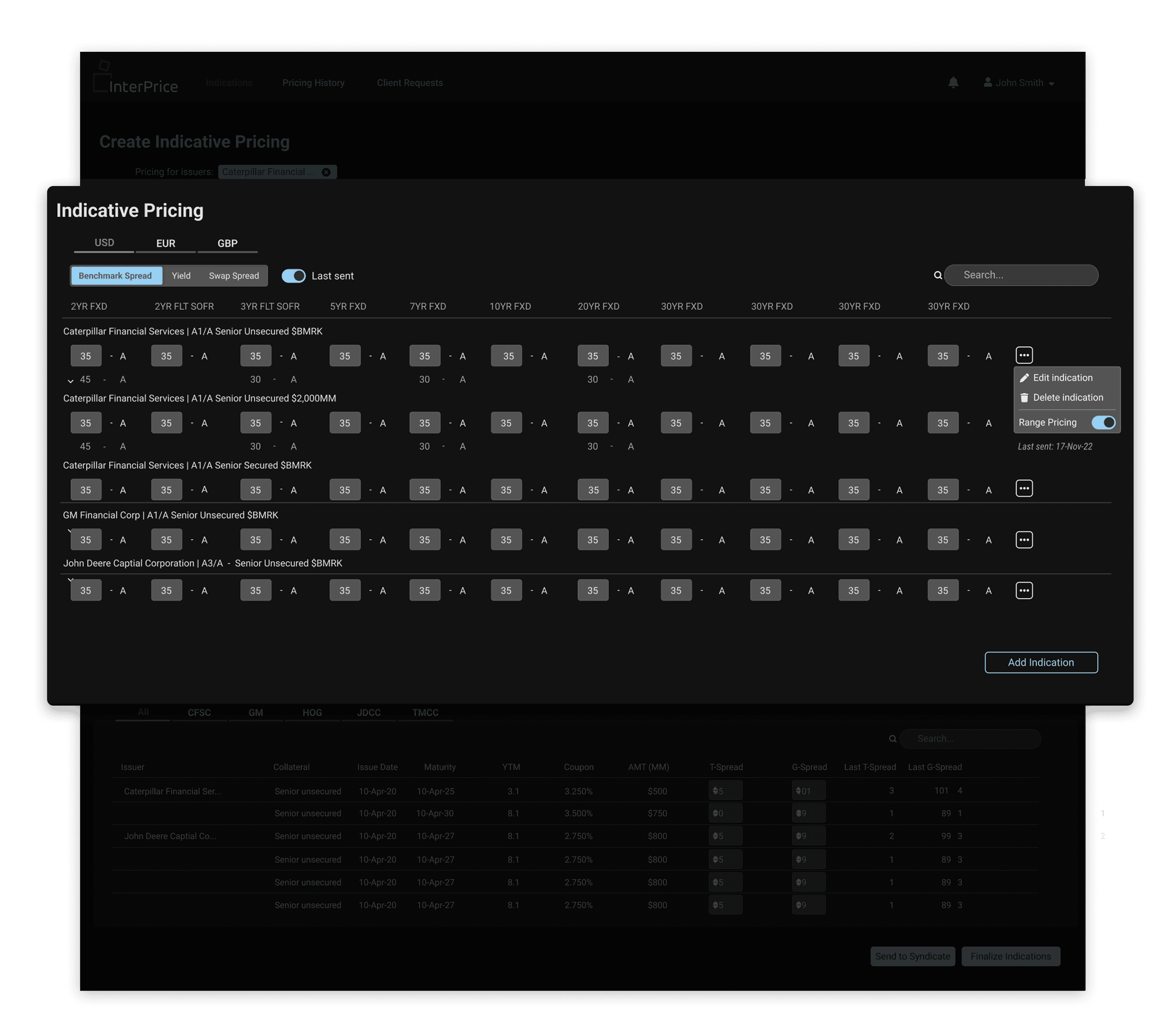
The original desktop-only version: dense and table-heavy, and the starting point for a simpler mobile experience.
The product manager sketched an initial flow from the pricing logic; my job was to make it work in the hand. So I cut steps, surfaced the key details first, and kept the core pricing actions one tap away.
The low-fi flow was built around the core task: review pricing, layer in scenarios, and send, with the pricing action always in reach.
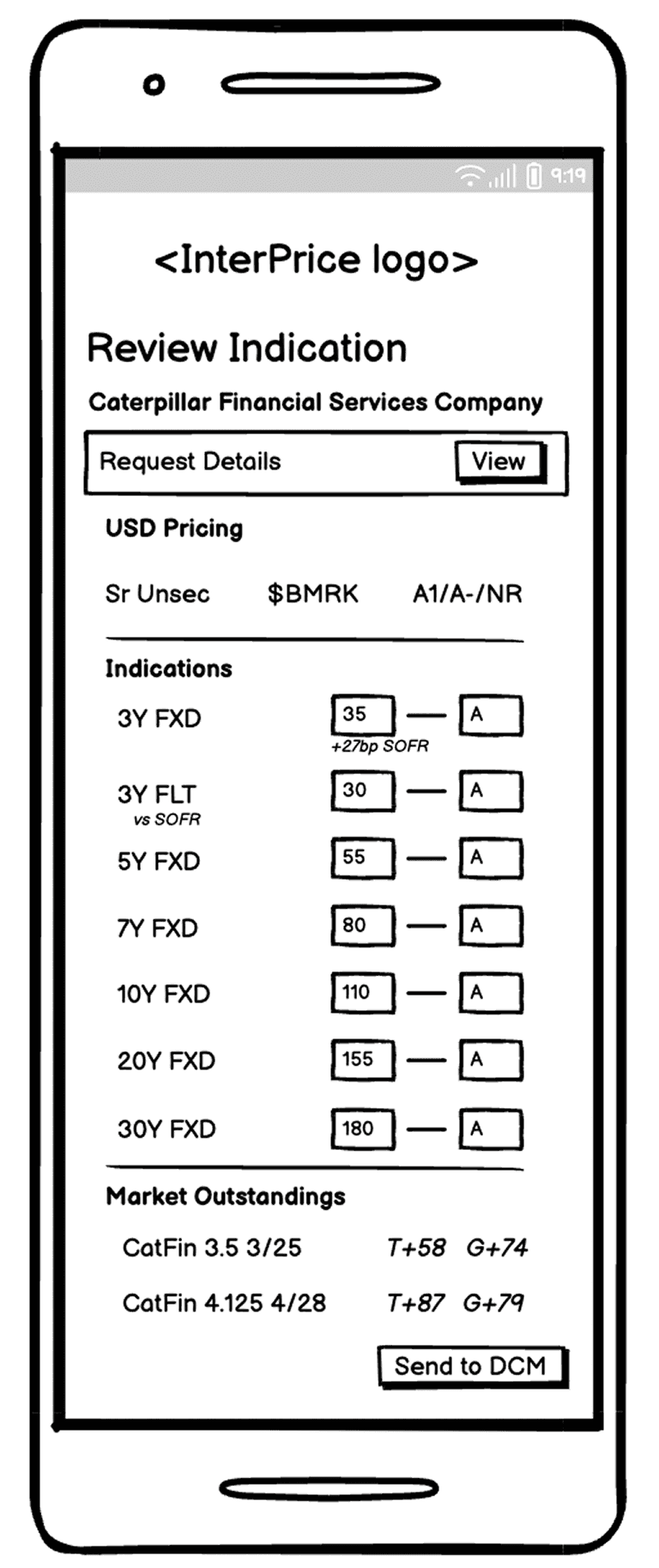
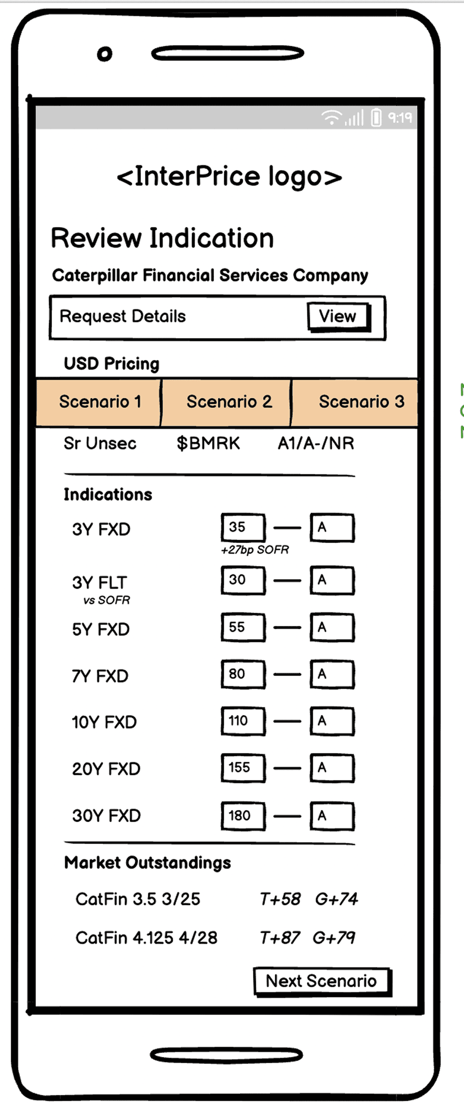
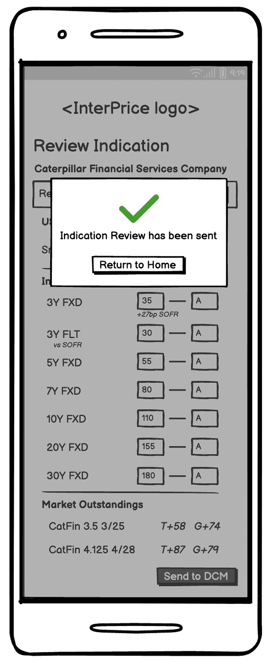
Before going further, I pressure-tested the low-fidelity flow against how it would actually feel on a phone. Three things would have tripped users up:
A misleading landing screen. After tapping “Review,” users hit a near-empty page instead of the pricing they came for.
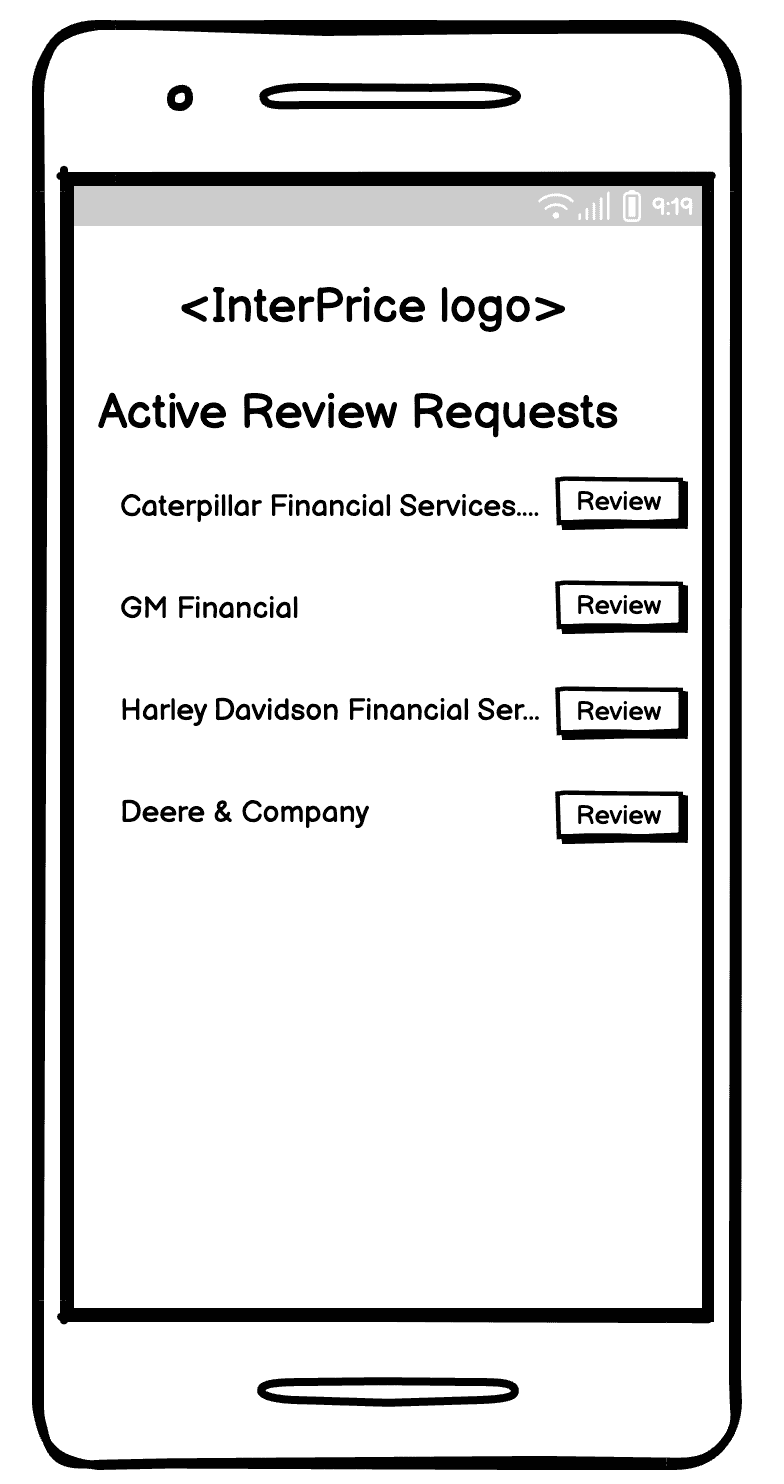

Pricing buried behind details. Users had to read request details before they could see or act on pricing, adding load with no payoff.
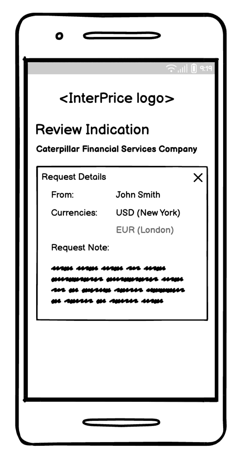
Missing basics. No back button, sign-out, or validation, so users couldn't tell if they'd done it right.
So I reworked the flow to put pricing first and strip the steps between a user and their next action.
In high fidelity I designed for the hand, not just the screen: tap targets, spacing, and the iOS safe area, tested on a real device so I could feel the reach.
The trickiest call was the title and “View Details” treatment. I tested four versions against one question: does it give context without stealing space from the actual task, pricing?
Option 1 won: the title gave just enough context, with “View Details” close by and easy to find. The others either ate the screen with an oversized title or hid “View Details” where users would miss it.
Final design
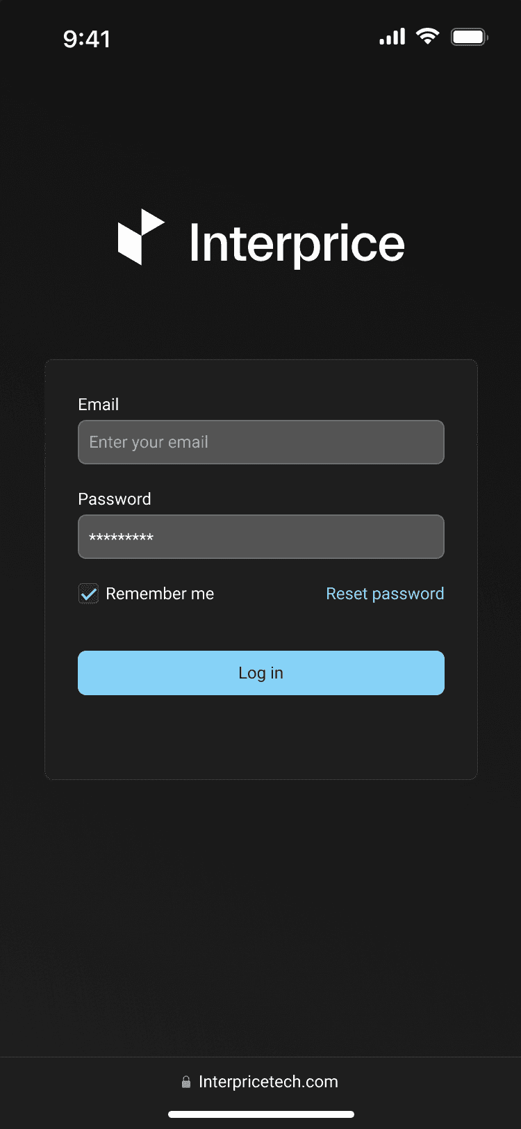
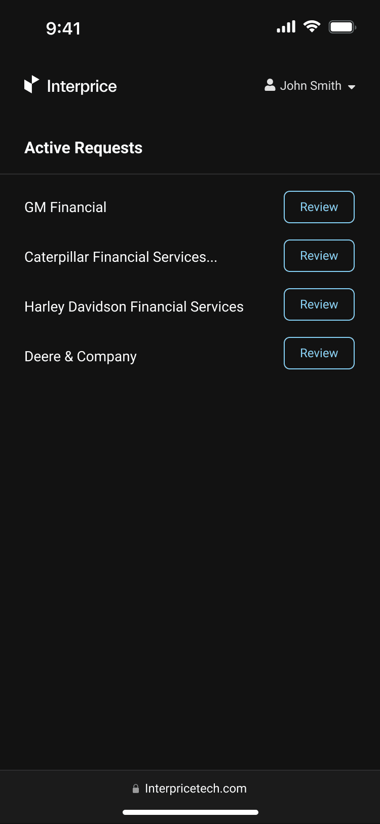
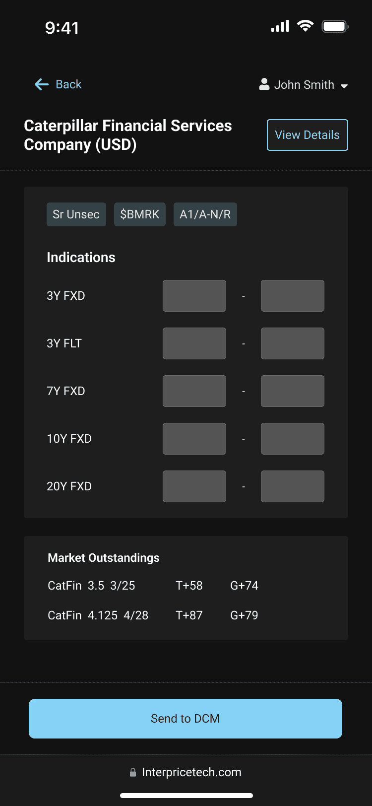
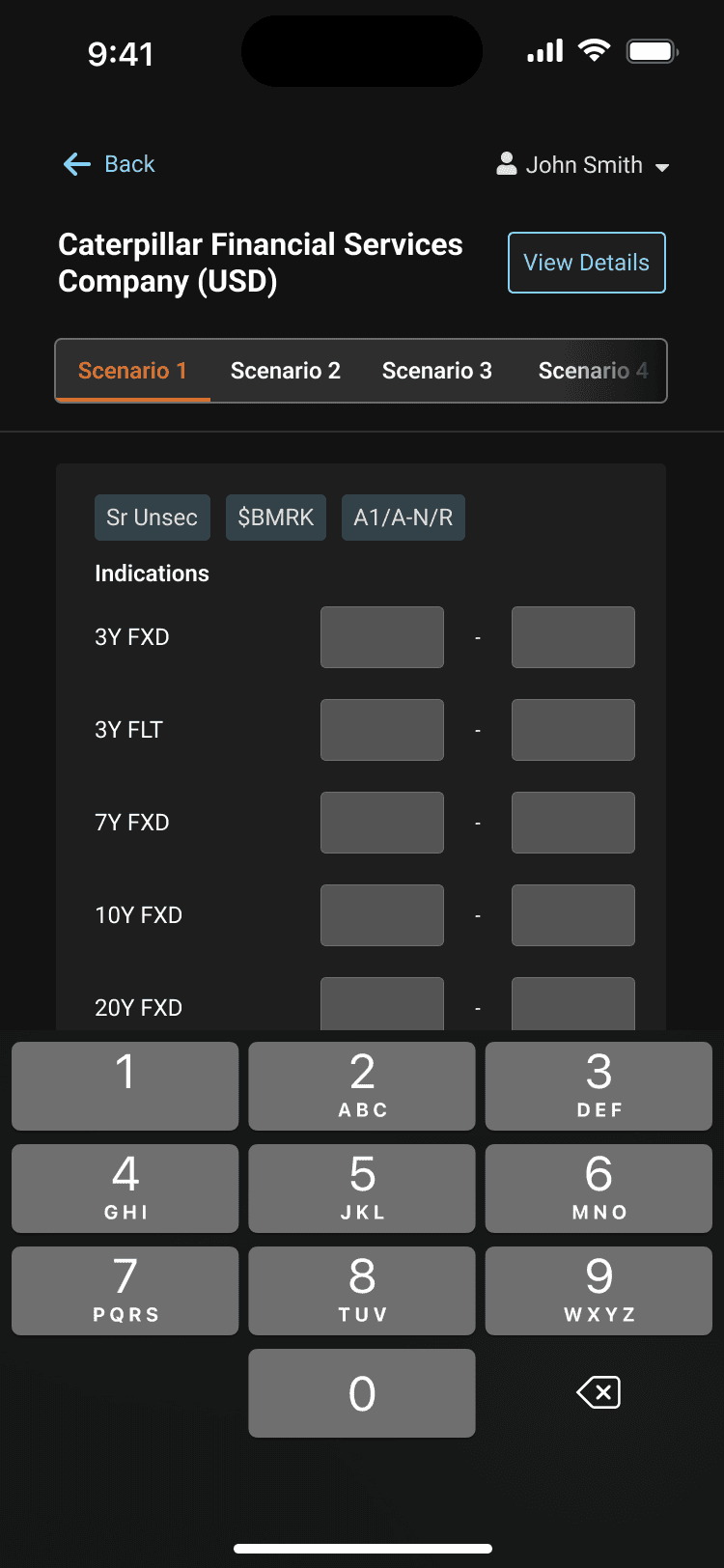
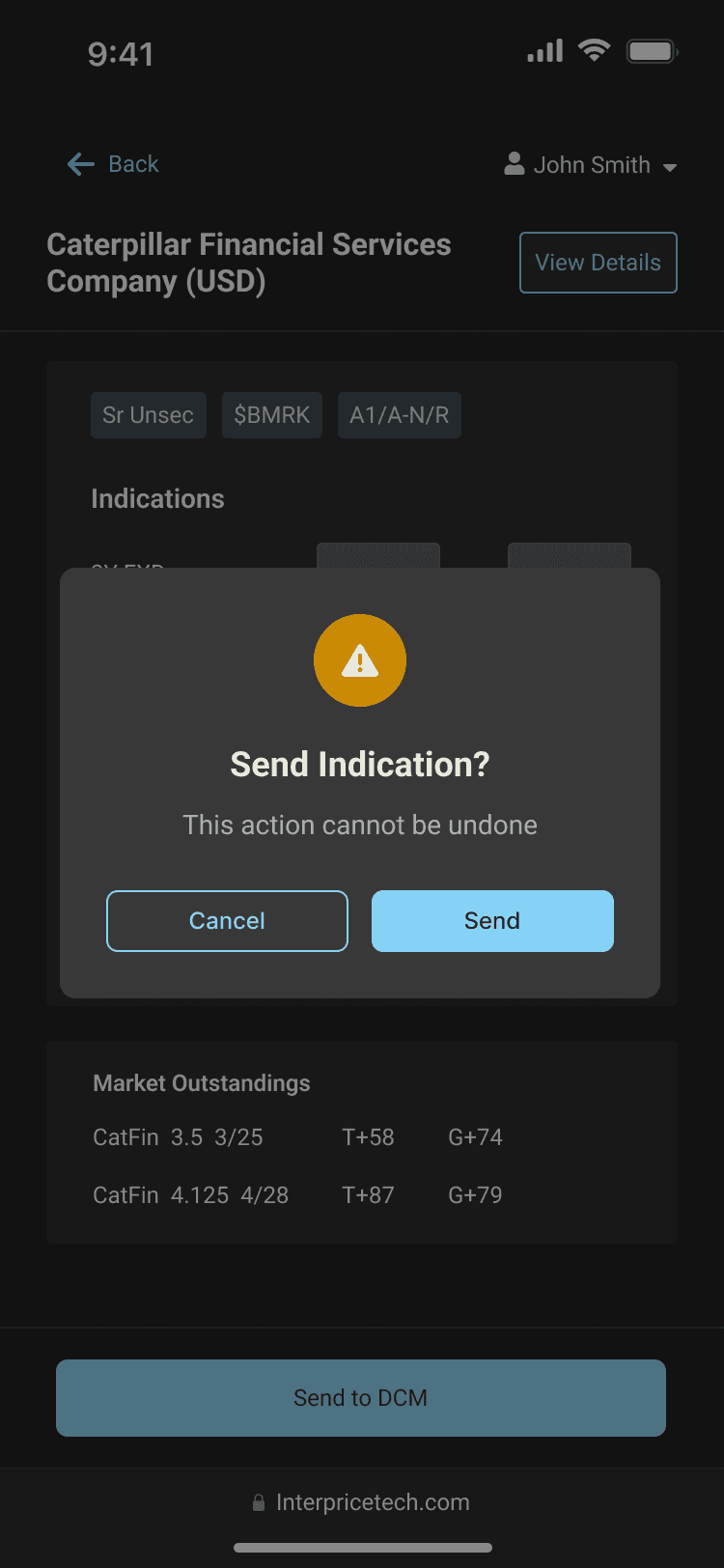
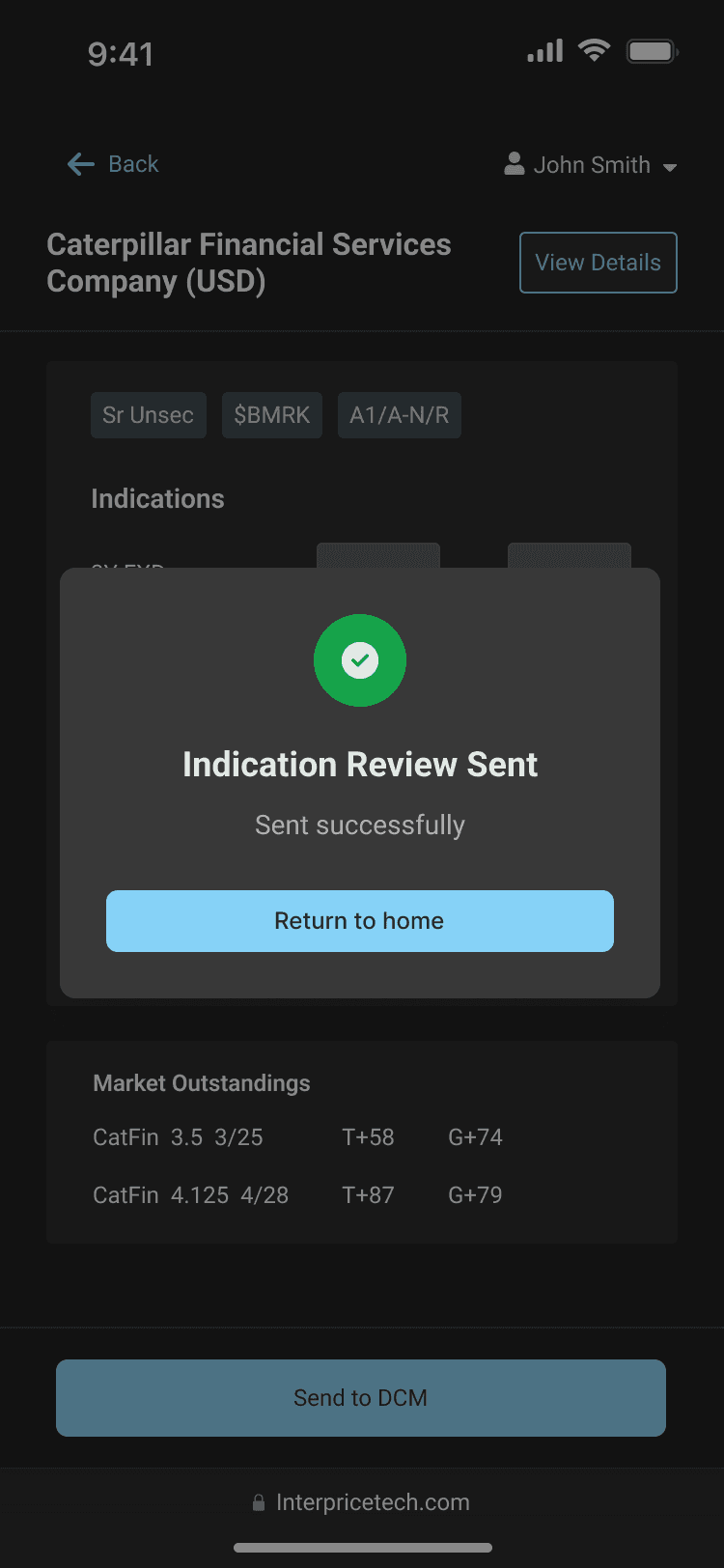
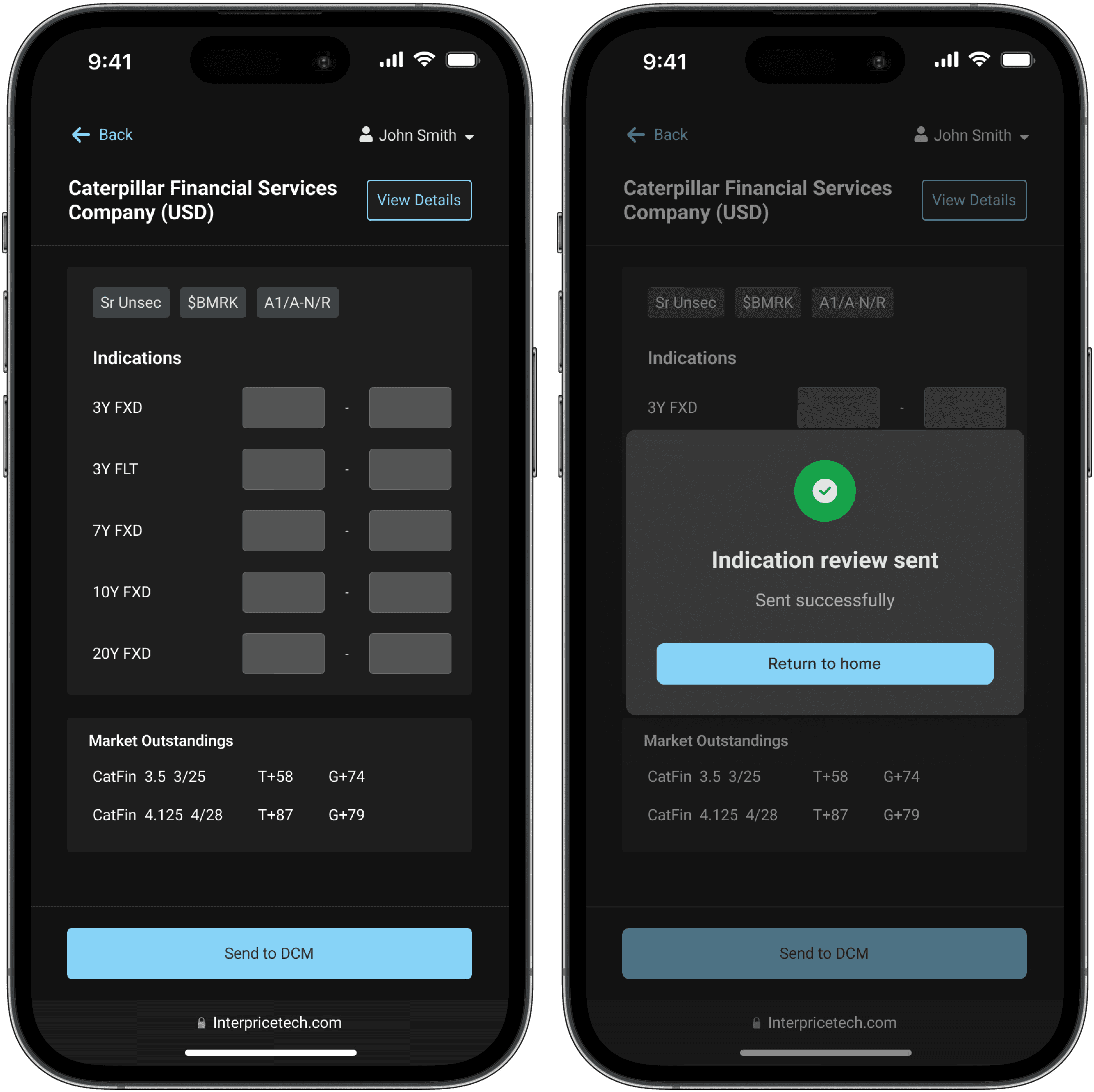
The result put the key details up front and cut the steps between opening a request and sending pricing, so users could act fast and confidently, even on the move.
I prototyped the flow on a real device, because reach, tap comfort, and pacing are things you can only judge in the hand, not in a static mock. It also gave the PM and developers a shared reference to build against.
Handoff. I prepped the iOS safe-area version and turned on Figma Dev Mode so developers could pull specs straight from the file, along with a written list of the features to build against.
Quality assurance. Once it was built, I tested it on my own phone to make sure everything held up in the hand. QA took a few rounds of back and forth before the details were right.
After rollout, the team saw the shift they were after: