Dashboard redesign

A live, shipped redesign of the home dashboard for a B2B SaaS finance platform.

The dashboard gave users a dense wall of market data, but not enough guidance on what to do next. I initiated the redesign and co-led it, turning the dashboard into a decision-making launchpad: clearer hierarchy, faster access to core tools, and sharper signals about pricing movement.
220%key-page views YoY
+27%dashboard engagement
Role
Co-lead designer
Timeline
Jan – Feb 2024
Team
2 designers + PM and engineering
Methods
User interviews · Analytics review · User flows · Wireframing · Prototyping
1. The original dashboard
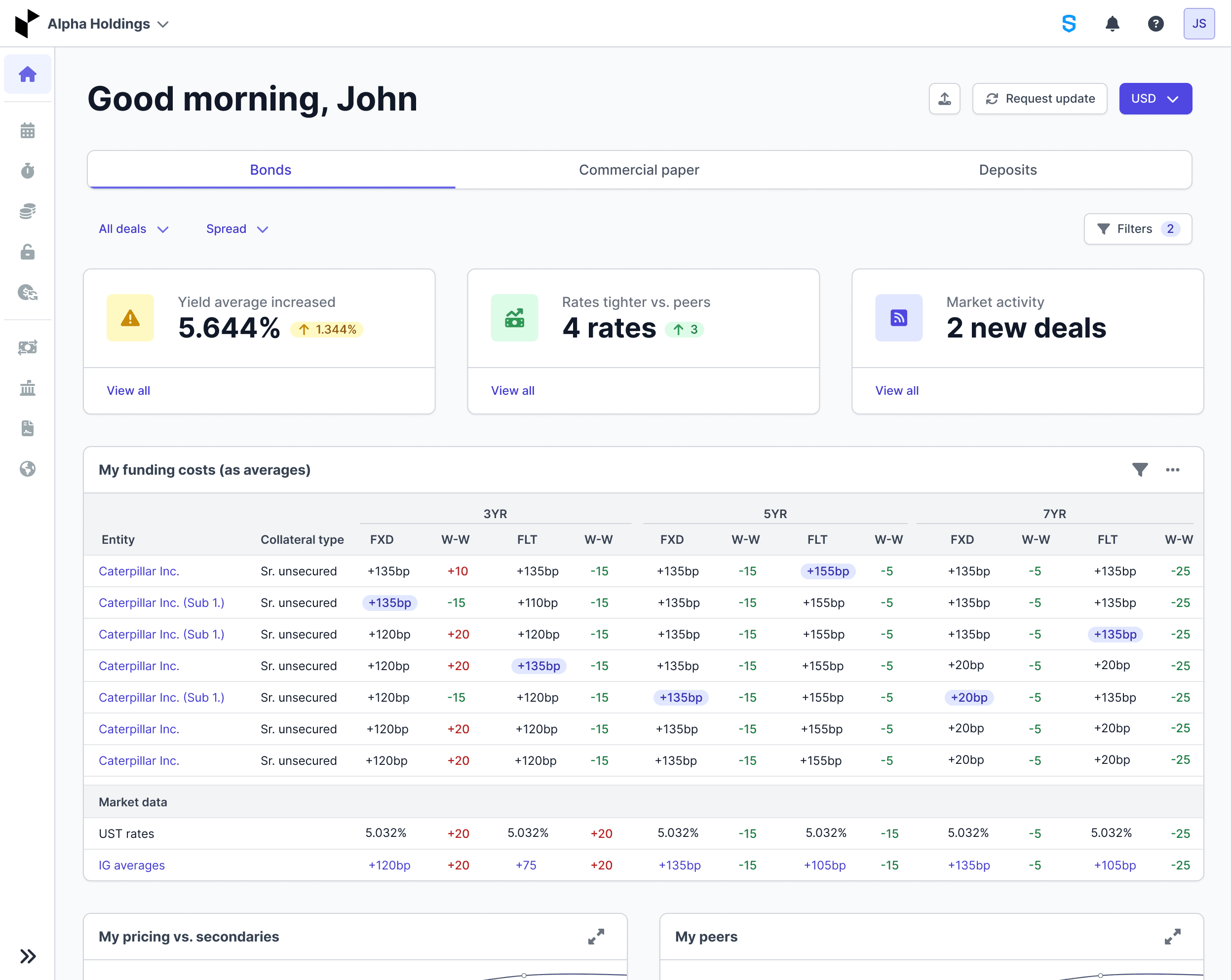
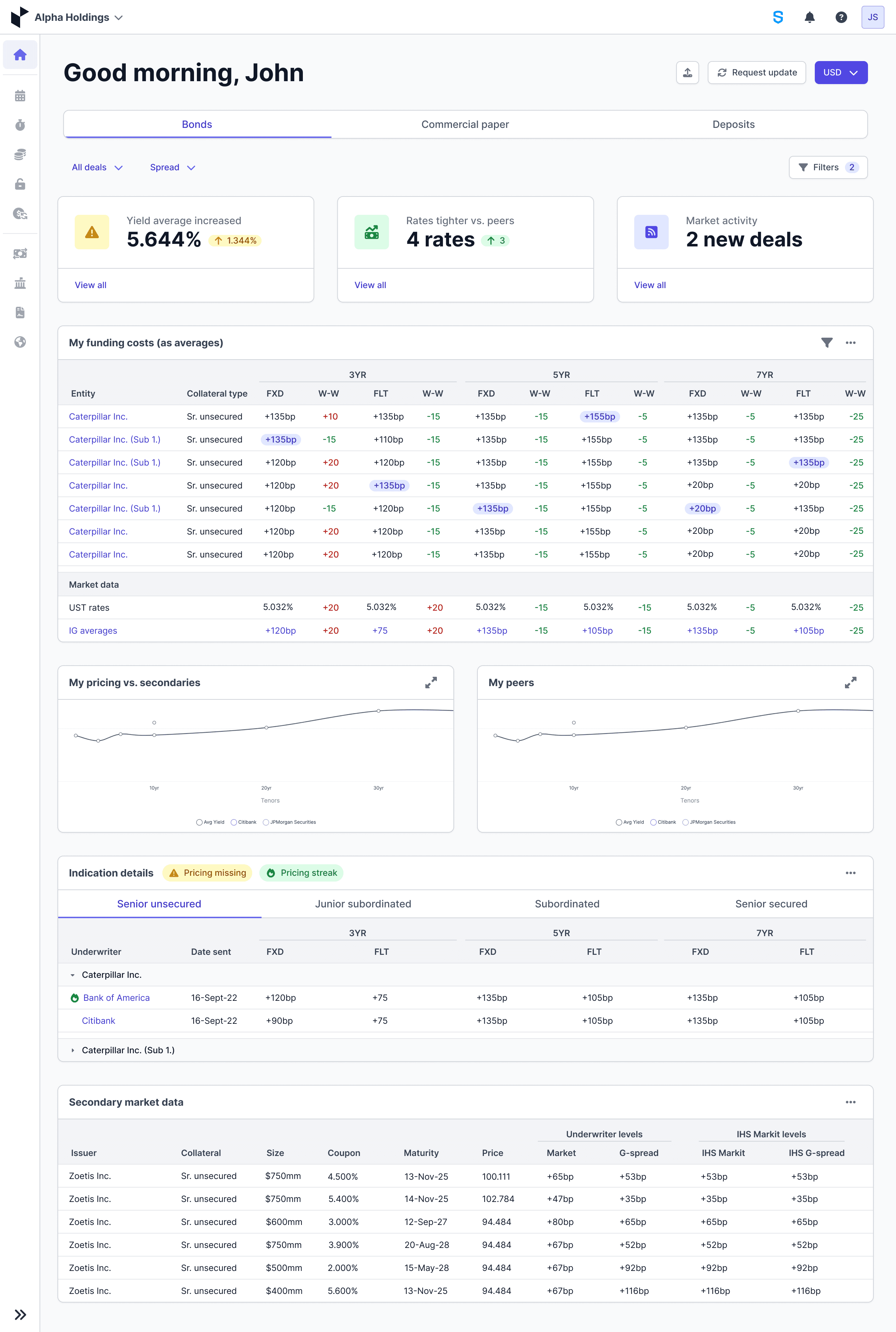
A wall of numbers with no hierarchy and no guidance on what to focus on. Users struggled to extract value from dense data.
1. The original dashboard
2. Tabbed iteration
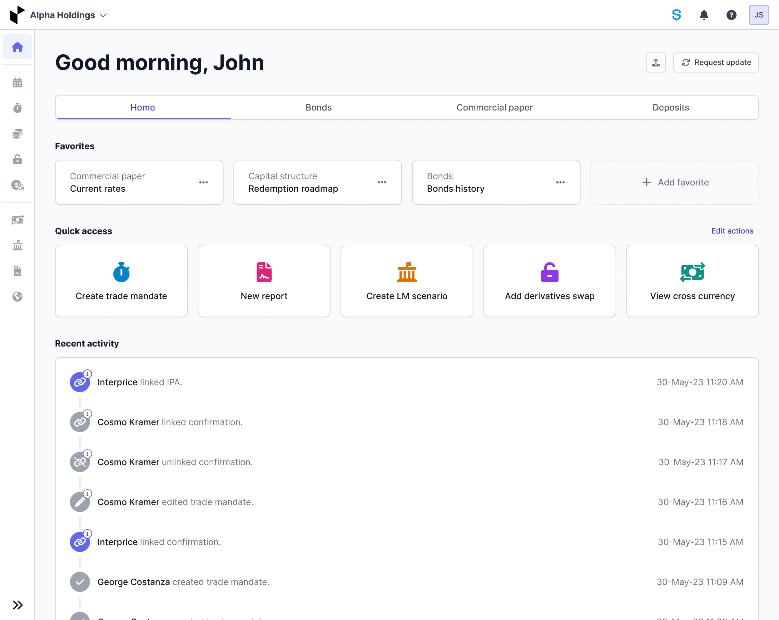
3. Widget experiments
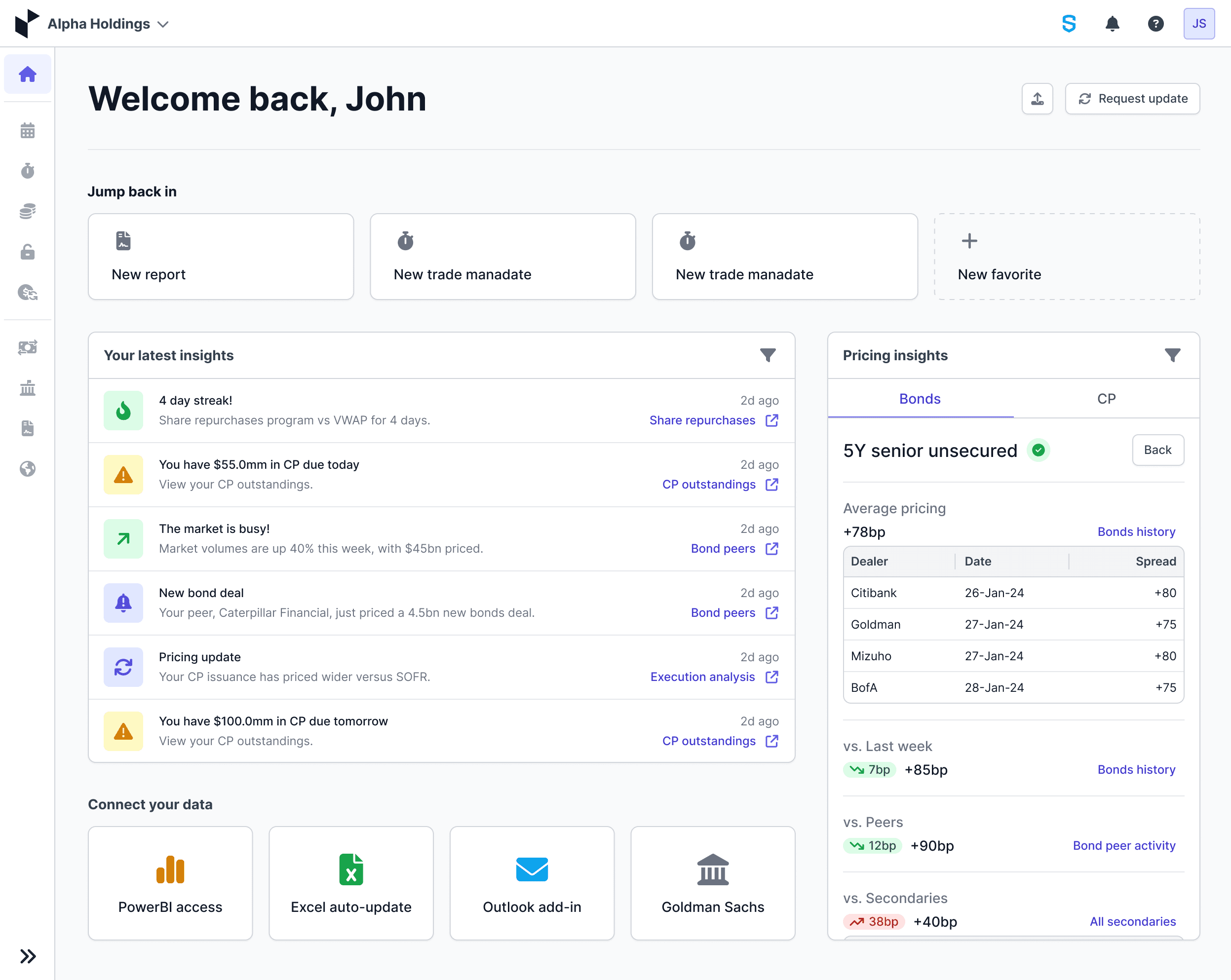
4. Guided updates
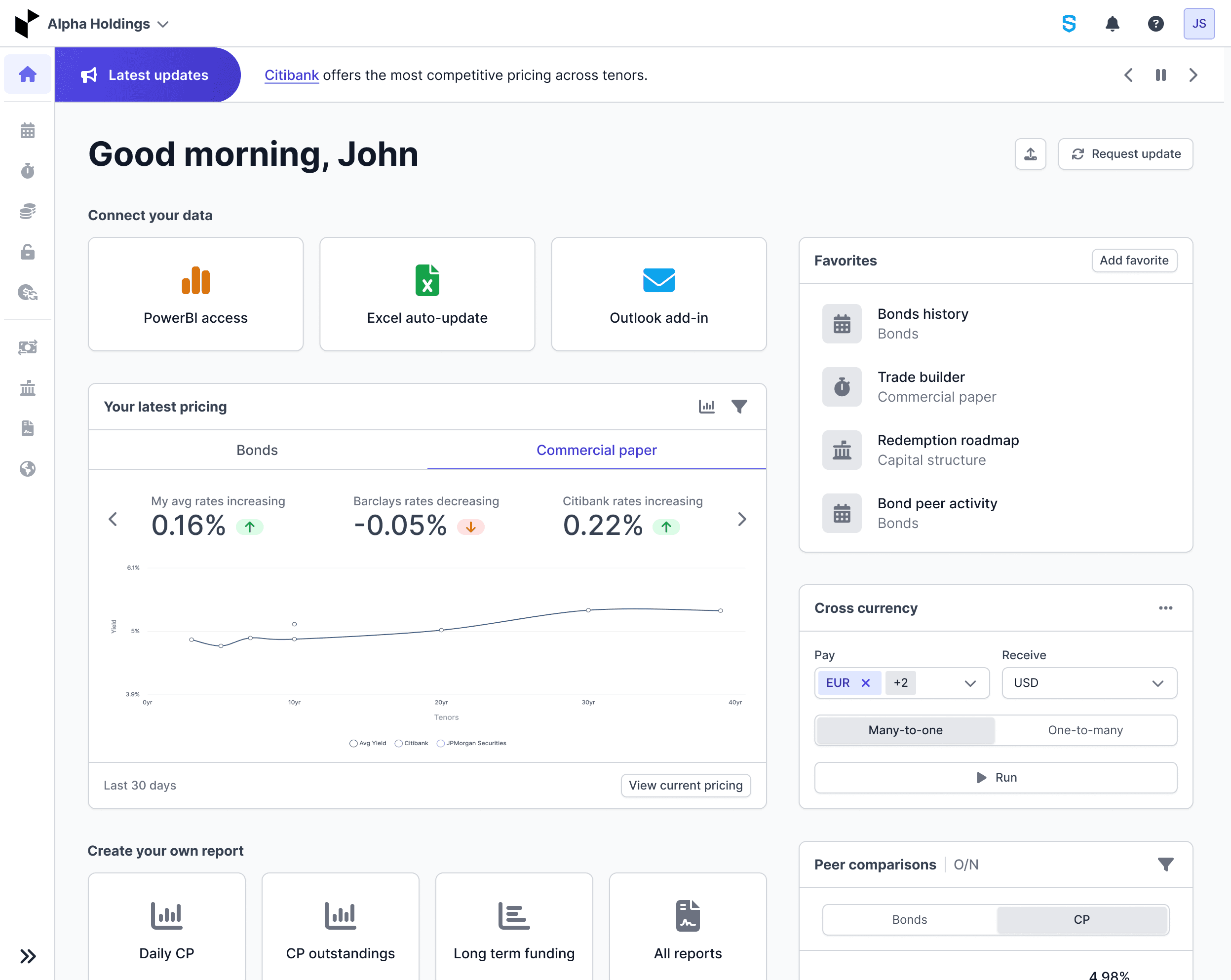
5. Final: insights feed
6. Final: pricing at a glance
What users told us
“A lot of good data, but what is it really telling me?”
“The graphs are hard to read; I just look at the data in the table below.”
“Too much information. It feels like a lot of the same thing.”
01
The problem
A data-rich dashboard that left users unsure what to do next.
No hierarchy
Too much data shown at once, so nothing stood out as important.
No takeaway
Stat cards showed numbers but never what to do about them.
Hard to navigate
Charts were hard to read and filters were hard to find.

The cost ran both ways: some users ignored the dashboard entirely, while others leaned on it so heavily they missed tools and updates elsewhere in the platform.

The full picture. The original dashboard in one scroll: every module competing for attention, no clear next step.
02
Goals and challenges
Make the dashboard decisive, not just cleaner, without losing the depth power users relied on.

The goal wasn't to make the dashboard look cleaner. It was to make it more decisive: help users understand what changed, know where to go next, and reach the right tool quickly. The challenge was doing that across different user roles without removing the depth power users depended on.

03
Exploring concepts
Three directions, judged against one bar: help users act faster without losing the workflows they trusted.

We explored three directions and evaluated each against a practical bar: would it help users act faster without taking away the workflows they already trusted? The two-column direction was mine, separating what is happening from what to do next. The team's sticker voting backed it, and I took it furthest.

Tabbed
Familiar, but users still missed key updates on login.
Two-columnChosen
Split what is happening from what to do. Drew the most votes.
Personalized
Too much to ship, but its show-me-what-I-care-about idea carried forward.
Taken furthest: a highlighted number with supporting data, an activity history, and tables, all in one scannable view.
04
User interviews
Three daily users confirmed the pattern: plenty of data, not enough help interpreting it.

I led research with three daily pricing users. A small sample, but enough to confirm a pattern already showing up in analytics and stakeholder feedback: they had plenty of data, but not enough help interpreting it. That reframed the brief from “show more information” to “make it easier to act on.”

What we heard
What we changed
The stat cards don’t tell me anything.
Replaced them with widgets that surface recent activity, peer positioning, and pricing movement.
Filters and navigation are all over the place.
Consolidated navigation so high-value destinations are visible, not buried.
The graphs are hard to read.
Cleaner, more contextual visuals with a clear takeaway.
Is my pricing okay?
Summary takeaways and trend indicators answer it at a glance.
I’d want to customize it.
Kept the core stable and deferred full customization, so users got value immediately.
05
Design iterations
If a module didn’t help users interpret, decide, or act, it didn’t belong on the dashboard.

One principle drove every iteration: if a module didn’t help users interpret, decide, or act, it didn’t belong on the dashboard.

  • Stat cards were removed because usage data showed they weren’t driving decisions.
  • Hard-to-read charts were simplified or replaced with more contextual visuals.
  • Full customization was deferred until the default experience was clear enough to build on.

What survived earned its place by answering a user question quickly: favorites for fast access, latest insights up top, and clear paths into deeper tools.

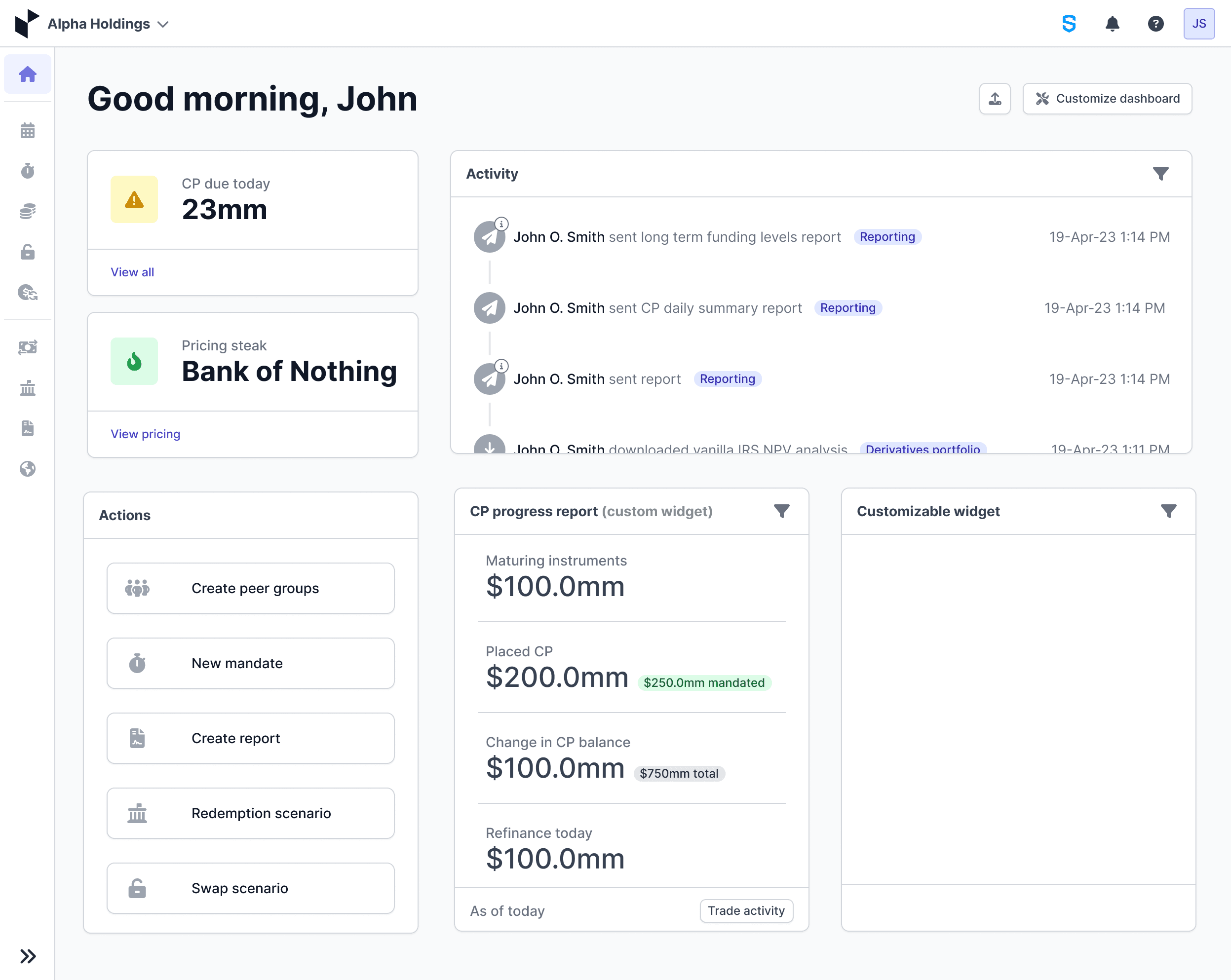
Tested, then cut. Customizable progress widgets sounded good, but usage data said users wanted answers, not assembly.
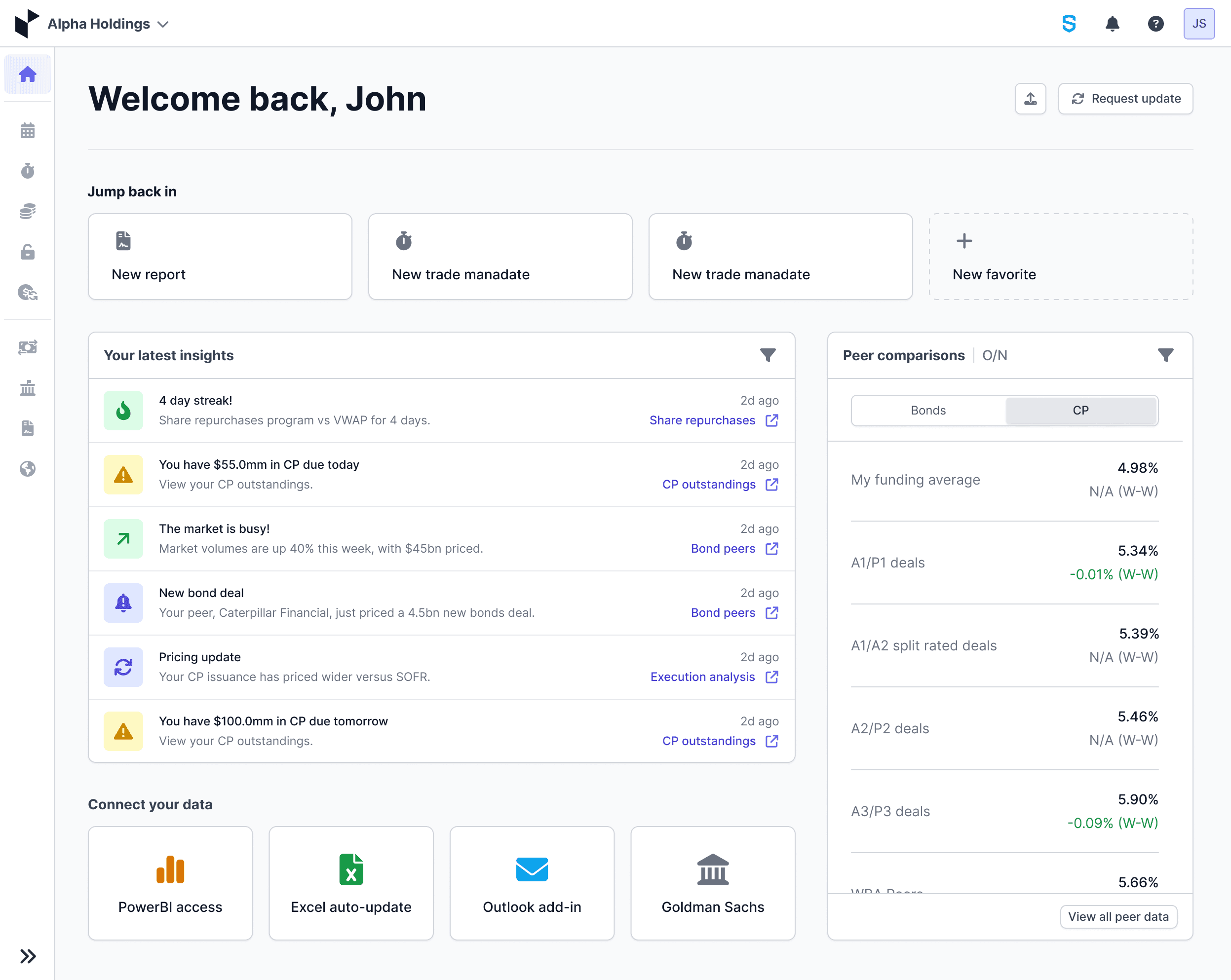
What shipped. The two-column insights feed: actionable insights on the left, peer positioning on the right.
06
Impact
A clearer job for the dashboard, and measurable lift on the pages it routes users to.

The redesign gave the dashboard a clearer job: help users decide where to go and what to do next. After rollout, dashboard engagement increased by about 27%. A key destination the dashboard surfaces, the current-pricing page, also saw year-over-year views rise from 106 to 339, with users up 211%, even while overall platform traffic declined.

0%Views on the key pricing page, year over year
+0%Users on that page, year over year
+0%Dashboard engagement in the rollout month
BeforeClick to enlarge
Before
AfterClick to enlarge
After

Interested in working together?

Create a free website with Framer, the website builder loved by startups, designers and agencies.